App Download
 |  |  |
 |  |  |
First Steps
Login Process
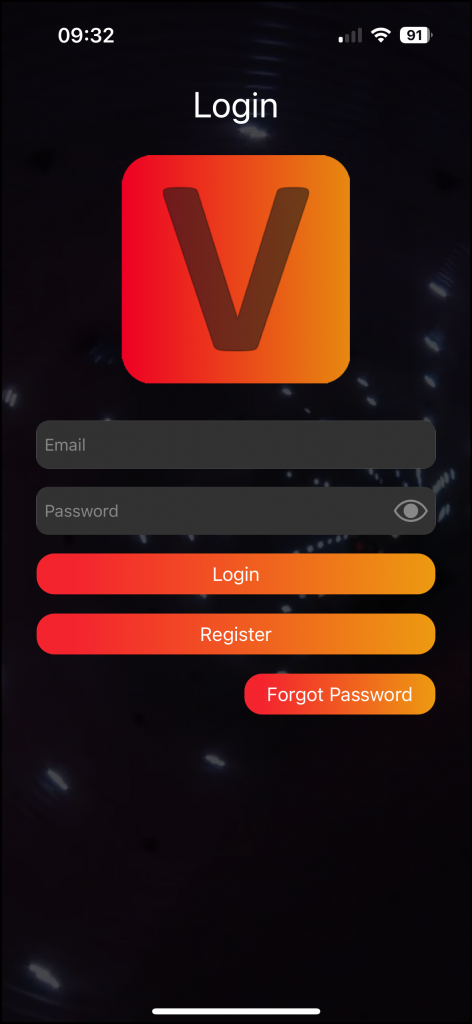
Open the app to access the Login screen.
- If you already have an account:
→ Enter your credentials, including your email address and password. - If you forgot your password:
→ Click on the „Forgot password“ button.
→ Enter your registered email address.
→ Check your email for a password reset link.
→ Follow the instructions in the email to reset your password.
- If you don’t have an account:
→ Click on the „Register“ button.
Registration
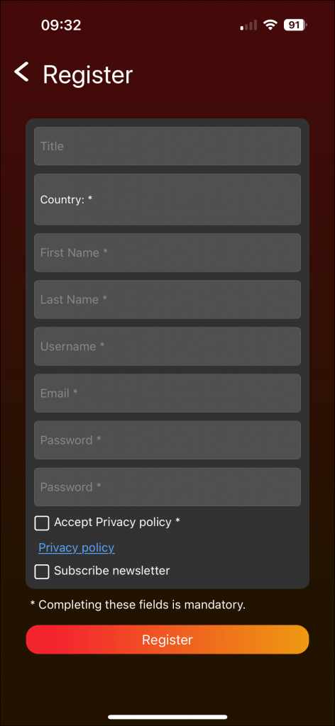
- Fill out all the required fields on the registration page.
- Click on the „Register“ button to submit your information
- Check your email for a confirmation message.
- Click on the confirmation link provided in the email. After clicking the confirmation link, a success message will be displayed on the website. If you click the link a second time, an error message may appear; you can safely ignore it, as the confirmation was successful the first time.
- Return to the Zumtobel App and use your registered email and password to log in.
Note:
For security reasons, it is recommended to keep your login credentials confidential.
Prepare App and Grant Permissions
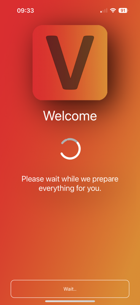
The app is undergoing preparation, and this process may take some time.
 If there is no internet connection at this stage, the app will not launch, as it requires library information that is not available without internet access.
- Click „Next“ to proceed.
- Grant permission for Bluetooth by clicking „Request.“
- A popup will open; click „Ok.“
- Finally, click „Start.“
Find Fixtures and Create Network
Discover Page

After login you are prompted to the discover page. Ensure that Bluetooth is on and app has full access. Swipe down to search for fixtures and networks.
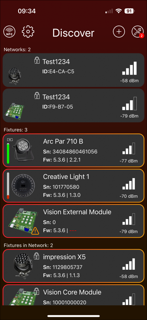
General information
Scan
A scan is discovering Bluetooth fixtures in proximity that are both powered on and configured with Vision as input source.
Mobile Layout:

Swipe down on the screen to initiate fixture scanning.
Desktop Layout:

Press the „Refresh“ button with the two arrows located at the top to scan for fixtures.
Scanned fixtures will appear incrementally in a fly-in fashion. Please be patient from clicking on them until the scan is fully completed.
Red Badge

- A red badge with a white number signifies required or highly recommended actions.
- Click on the corresponding icon or frame near the badge to proceed with recommended actions.
- This may involve navigating through multiple tabs or pages until you reach the execution of the action.
- Examples for a red badge are:
- Vision firmware updates
- Main-Firmware Updates
- service counters exceeding 7,000 hours.
Frames
The discovery page showcases various frames after completing a scan.
The subsequent frames will be explained in detail:
Selection:
- Click on the fixture image to select or deselect it; a red/orange frame indicates selection.
- Only selected fixtures are relevant for functions in the Tools Icon.
Bluetooth Connection:
- Click on the fixture frame (except the image) to connect with the fixture via Bluetooth.
NFC
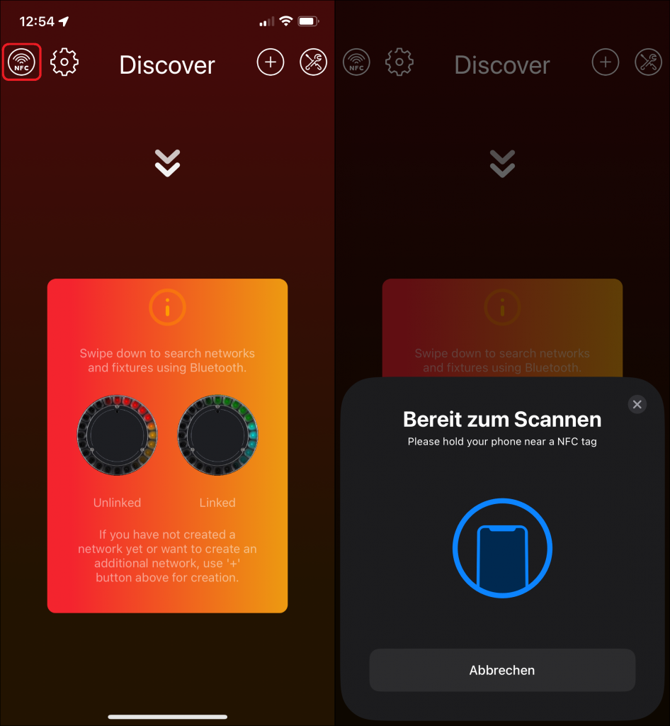
- Android: In the Discover Page just hold your smartphone near your fixtures NFC. The Android smartphone will automatically detect the NFC and will connect to the fixture.
- iOS: Click the NFC logo in the upper left corner of the Discover page: Then hold your smartphone near your fixtures NFC and you will connect to the fixture.
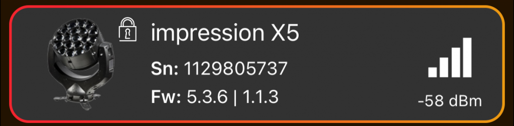
Icons and Text in Fixture Frame:
| Icon | Description | Significance | Action |
|---|---|---|---|
| Red Cross in Fixture Icon | The fixture has one or more errors. | An error indicates a serious issue with the device. | Click on the fixture frame to view and address the error details. |
| Orange Exclamation Mark in Fixture Icon | The fixture has one or more warnings. | Warnings suggest issues with the fixture, though not as critical as errors. | Click on the fixture frame to view and address the warning details. |
| Closed Lock in Fixture Icon | The fixture is linked to a network, and the correct password has not been entered. | Authentication is required for network access. | Enter the correct password to unlock the fixture. |
| Open Lock in Fixture Icon | The fixture is linked to a network, and the correct password has been entered. | Authentication successful, and the fixture is connected to the network. | Clicking on the fixture frame automatically establishes a connection to the fixture; no additional steps are required. |
| Sn (Serial Number) | “Sn“ stands for the Serial Number of a fixture. | Unique identifier for the fixture. | Used for reference or identification purposes. |
| Fw (Firmware) | „Fw“ stands for the Firmware of a fixture. | First version indicates iQ.Mesh Firmware and second version indicates Fixture’s Main-Firmware versions. | A red firmware indicates a newer version is available. Consider updating for optimal performance. |
Network Frame
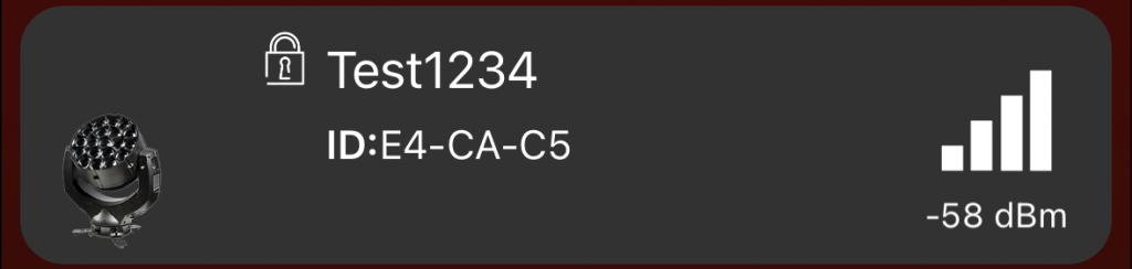
- Click on the network frame to access the network.
- Icons and Text in Network Frame is similar to the Fixture Frame.
- ID (Identification Number) – Description: „ID“ represents the identification number, a unique alphanumeric value used to distinguish between different networks.
Tools Icon

- The Tools Icon (wrench and spanner) opens a popup for Vision Updates, Fixture Updates, and RDM Manager.
- Functions in the popup affect only selected fixtures.
If both Vision firmware and fixture Main-Firmware updates are required, perform the Vision update first, then the fixture Main-Firmware update.
Plus Icon

- Click the plus Icon to create a new network. Refer to “Network Creation” chapter for more detailed information. The plus icon pulsates when no network is detected, indicating that it is recommended to take action and create a network.
Settings Icon

- The Settings Icon (gear) opens the settings page.
- In the discover page, settings are reduced compared to the network settings.
- For detailed information see “Network Shell” -”Settings” Chapter
Fixture Page
After clicking on a fixture in the discover page, the app connects with the fixture and opens the fixture page.
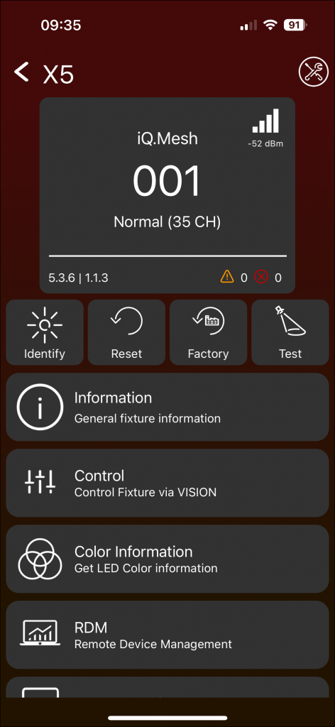
The Fixture Page presents various frames and icons to display information or prompt actions.
Click on the icons or frames below to perform the described actions.
Info-Panel
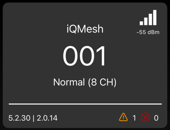
The Info-Panel displays:
- Input Source: iQ.Mesh (Tap can change)
- DMX Address (Tap can change)
- DMX Mode (Tap can change)
- Signal strength in the top right (not clickable)
- iQ.Mesh firmware and fixture Main-firmware in the bottom left (not clickable)
- Warnings and errors in the bottom right (not clickable)
Identify
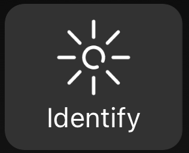
Use this function to highlight your fixture for identification purposes.
Reset

You can reset your fixture in two ways:
- Warm Reset:
- Involves restarting the fixture without cutting power to the entire device.
- A controlled reset to reinitialize internal settings without disrupting the DMX network.
- Cold Reset:
- Involves completely cutting power to the device and restoring power.
- More drastic; suitable when a device is unresponsive or encounters a serious error.
- Disruptive to the DMX network during the power-off period.
Factory Default
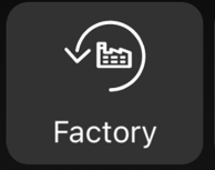
Use Factory Default to instruct the device to revert to its original manufacturer-determined settings.
Test

Activate different test modes, including Pan Tilt Test Mode, Lamp Zoom Test Mode, and All Test Modes.
Information
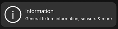
Information
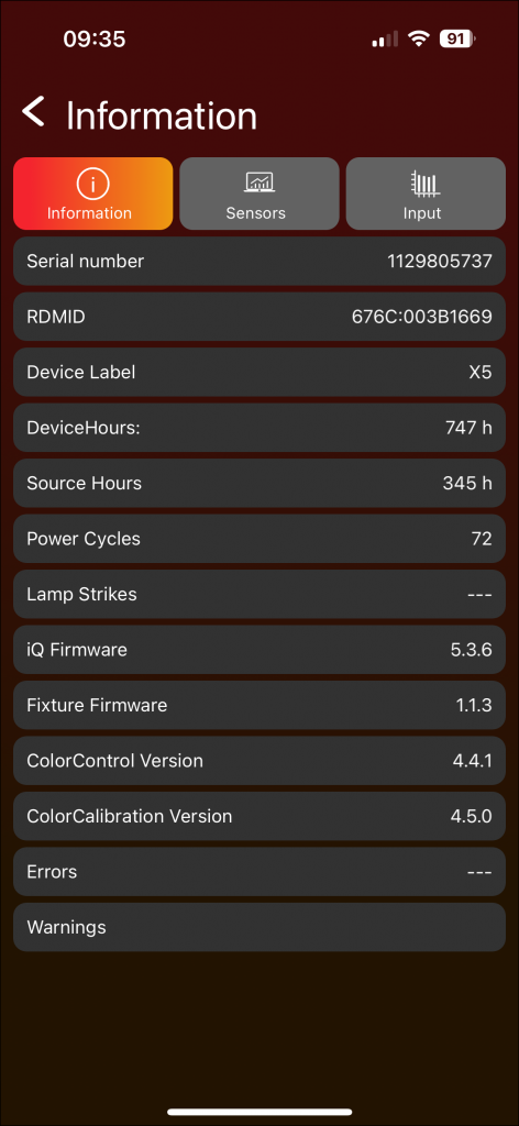
- View various fixture information and detailed error/warning messages.
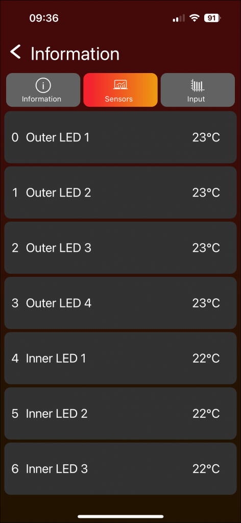
Sensors
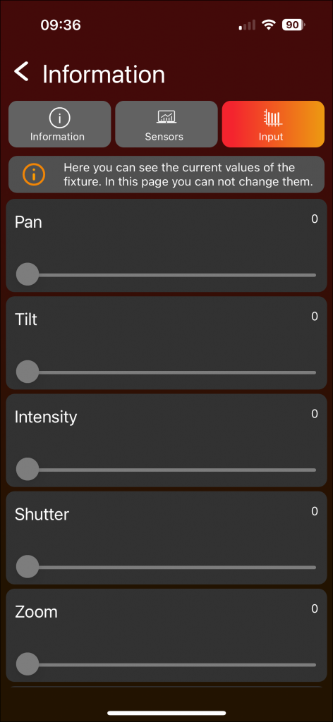
Source Input
Control
In this section, control the individual fixture.
Detailed information on how control works can be found in the “Network Shell – Control” chapter.
Network Creation
To control one or multiple fixtures it is necessery to setup a control network first and link all fixtures into this network. To setup a network a setup wizard is available which guides you through all steps.
The wizard consists of a series of pages that guide you step by step through the process of creating a network.
Initiate Network Creation Wizard
1. Create Network Page
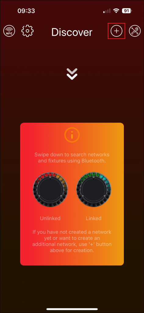
- Click the plus icon in Discover Page located in the top to start the network creation wizard. If no network is found after a scan, the plus icon at the top of the screen will begin pulsing and change its color to orange. This suggests that creating a new network is a recommended action.
→ The “Create Network Page” will open as follow:
Throughout the application, informative yellow animations, such as the one near the „Secured Network“ label, provide additional details. Click on these animations for relevant information.
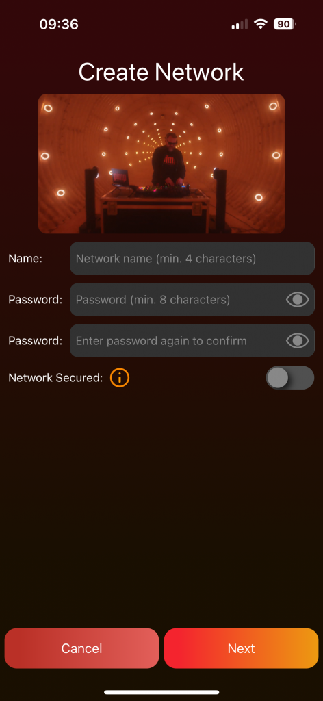
- Enter a network name and password.
- Toggle the visibility of the password by clicking the eye icon if necessary.
- Activate the secured network with the On/Off Switch; by default, it is deactivated.
 In a secured network, only the Account which created the network has administrative rights to adjust settings.
 - Click „Next“ to proceed. The network creation process can be canceled at any time by clicking the red „Cancel“ button.
2. Link Fixtures Page
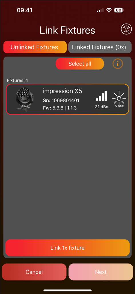
The left tab displays “Unlinked Fixtures” and the right tab shows “Linked Fixtures”.
“Unlinked Fixtures”
- In the unlinked fixtures tab, scan for available fixtures by swiping down in Mobile Layout or pressing the „Scan“ button in Desktop Layout.
- Highlight a fixture by clicking the sun icon for easy identification.
This process can take some time because it must first establish a Bluetooth connection. - Select fixtures for linking, → then click „Link fixtures.“
A popup shows the linking process. - At the end a popup shows the results for each fixture.
To obtain more information, click on the frame.
This is especially beneficial in situations where the linking process might not have been successful. - After clicking „Close,“ an automatic scan will initiate, allowing the addition of further fixtures to the network.
“Linked Fixtures”
- In the Linked fixtures tab, successful linked fixtures are displayed.
To remove fixtures, select them and use the remove button at the bottom. - Proceed by clicking „Next“ and then „Connect“ to establish a connection to the mesh network
- If issues arise, click „Try again“ until it succeeds.
NFC Icon
You can also link fixtures via NFC:
- IOS: Click the NFC Icon in the upper left corner. Then hold your smartphone near your fixtures NFC, the fixture will be connected to the network.
- ANDROID: Hold your smartphone near your fixtures NFC. The Android smartphone will automatically detect the NFC and will connect the fixture to the network.
3. Name Fixtures Page
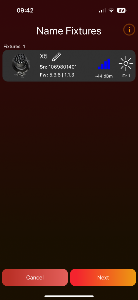
- Rescan fixtures in the network by swiping down in Mobile Layout or pressing the „Refresh“ button with the two arrows located at the top in Desktop Layout.
- Change a fixture’s name by clicking on it or the edit pencil.
Renaming fixtures is a beneficial feature if you wish to view them in a specific order, as they will be presented alphabetically on the Light Page. - One fixture serves as the master which is indicated by a blue signal strength icon.
This fixture establishes a connection through Bluetooth, while all other fixtures act as slaves and connect via Vision. - Click „Next“ to continue.
4. Groups Page:
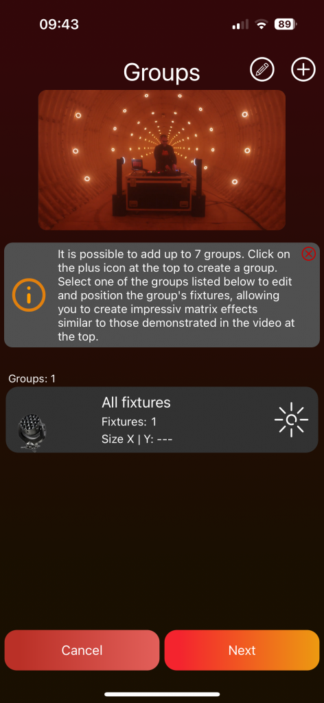
- The „All fixtures“ group is auto-created for easy control and cannot be deleted.
- Add a new group by clicking the plus icon at the top.
- Enter a name, select fixtures, and create the group by pressing „Add.“
- A popup will then appear asking if you wish to position the fixtures in your group. We strongly recommend doing so to enable powerful matrix effects.
- Create up to 7 groups.
- Click on a group frame to add/remove fixtures and to Position them. For the „All fixtures“ group it is not possible to add/remove fixtures you can only Position them. We strongly recommend doing so to enable powerful matrix effects.
- Position Fixtures:
- Unlock the power of matrix effects by positioning your fixtures within a 2-dimensional space.
- Select a geometric shape from the Popup and fill in information like horizontal and vertical fixture count if necessary
- Simply click on a fixture to highlight it, and then use drag and drop to place it. The available area is defined by the orange rectangle. This can be enlarged or reduced by dragging the orange line on the right or bottom.
- The button at the top, labeled ‚Shape‘, provides the opportunity to change the selected shape.
- The thin gray lines serve as positioning guides and center the fixtures placed within them. These guidelines can be activated or deactivated using the respective sliders at the top. If the vertical and horizontal guide lines are deactivated, the fixtures can be positioned freely without automatically centering between lines. By clicking on the number or line grid symbol at the top, the distance between the lines can be adjusted.
- If a circle is chosen as the shape, an additional offset for the degree line can be defined with the button in the top left corner.
- Furthermore, there is the option to rotate the fixtures. The red dot, positioned near the fixture, serves as a guide for the rotation and is located at the top left of the fixture when there is no rotation. To rotate a fixture, double-click on it. Then, a popup appears where the desired clockwise rotation in degrees can be chosen.
- Click the edit pencil at the top to enable the edit mode. Utilize the rubbish bin icon to delete a group, or click the edit pencil next to the group name to rename it.
- Proceed by clicking „Next.“
5. Finish Page:
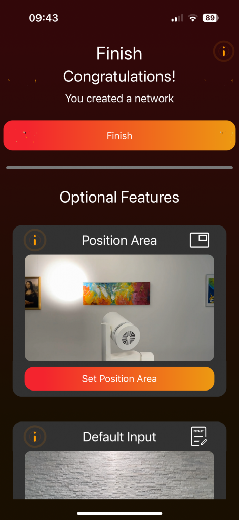
- Click „Finish“ to conclude the network creation process.
- Optional features such as „Position Area“, „Default Value“ and „FX Range“ are accessible below;
detailed explanations can be found in the „Settings – Network – Fixture Default Input & Range“ chapter.
Control Network

General Information
Wording Lexicon:
The parameters Pan, Tilt, Zoom, and Light Intensity will be referred to as components in the following context. Pan and Tilt collectively will be referred to as Movement.
Signal Strength:

At the top, an icon displays the signal strength to the network, indicating a connection.
If no signal strength icon is present, one of the following options will be displayed:
| Green loading circle | Indicates you are not connected, but the network has been found, and you are in the process of connecting. |
| Orange loading circle | Indicates you are not connected but actively searching for the network. |
| Red cross | Indicates no connection, the automatic search did not find the network. Click on the icon to search for the network again. |
Reset:
To reset all components (Pan, Tilt, Zoom, and Light Intensity) there are two options:

A reset icon with 3 light bulbs resets all components for all groups and fixtures.

A reset icon with 1 light bulb resets all components only for selected groups and fixtures.
Highlight:

Click the sun to illuminate the corresponding fixture or group.

As long as the highlight is active the sun will be displayed in yellow. Click once more to deactivate the highlight.
Fader:
Faders are designed to scroll more sensitively based on the touch point’s distance to the fader.
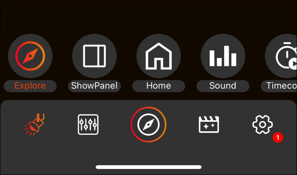
Page Navigation (Shell)
Click either the Shell Icon or the associated name to access this page.
Desktop Layout
At the Desktop Layout the shell is on the left side of the page, featuring:
Main:
- Control
- Home
- Scenes
- Settings
Special:
- Explore
- Showpanel
- Sound
- TimeCode
Bottom:
- Leave Network
The „Control“ page in the Desktop Layout combines the Light page and Control page of the mobile layout.
To exit the network and return to the discover shell, click „Leave Network.“
Mobile Layout
In the Mobile Layout the shell is at the bottom of the page, containing:
Main:
- Lights
- Control
- Special
- Scenes
- Settings
Special: To navigate to special pages. Swipe up on special icon.
- Explore
- Showpanel
- Home
- Sound
- TimeCode
Lights Page
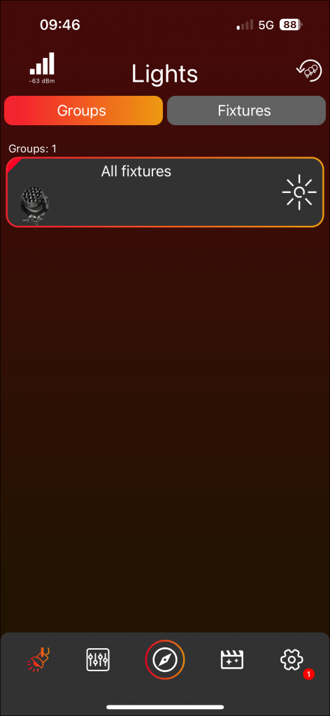
In the Desktop Layout, the Light Page doesn’t exist as a standalone page.
Instead, it forms the left side of the „Control“ page.
Groups

In the „Groups“ tab view, all groups are displayed.Click on the groups frame to either select or deselect them.
Fixtures

Navigate to the „Fixtures“ tab view to see fixtures within the selected groups.
If no group is selected, all fixtures in the network will be displayed.
Within the „Fixtures“ tab view, you have the ability to individually select fixtures. All fixtures belonging to the chosen groups in the „Groups“ tab view will be visible in this selection. When you opt to select individual fixtures, only those specific fixtures are chosen, excluding any groups selected in the „Groups“ tab view.
To illustrate:
For instance, Group 1 comprises Fixture 1 and Fixture 2.
- Choose Group 1 in the „Groups“ tab view.
- Navigate to the „Control“ page and set the Light Intensity to 100.
→ Consequently, all fixtures within Group 1, namely Fixture 1 and Fixture 2, will illuminate. - Press the reset icon located at the top to reset all components.
The icon consists of three light bulbs and a reset arrow. - Access the „Fixtures“ tab view, where Fixture 1 and Fixture 2 are displayed since they belong to Group 1.
- Select only Fixture 2.
- Proceed to the „Control“ page and set the Light Intensity to 100.
→ This action will result in only Fixture 2 being illuminated.
In summary, when the „Groups“ tab view is active, the selected groups dictate control.
Conversely, when the „Fixtures“ tab view is active, control is directed towards the individually selected fixtures.
- The selected groups or fixtures will be controlled on the „Control“ page.
- If a component is set for a group or fixture, small icons, referred to as bubbles, appear in the frames. Click on the bubbles to delete them.
Highlight

Select the sun icon to highlight a fixture, causing it to illuminate until the sun icon is clicked again to deactivate the highlighting.
While the fixture is highlighted, the color of the sun icon turns yellow.
Control Page
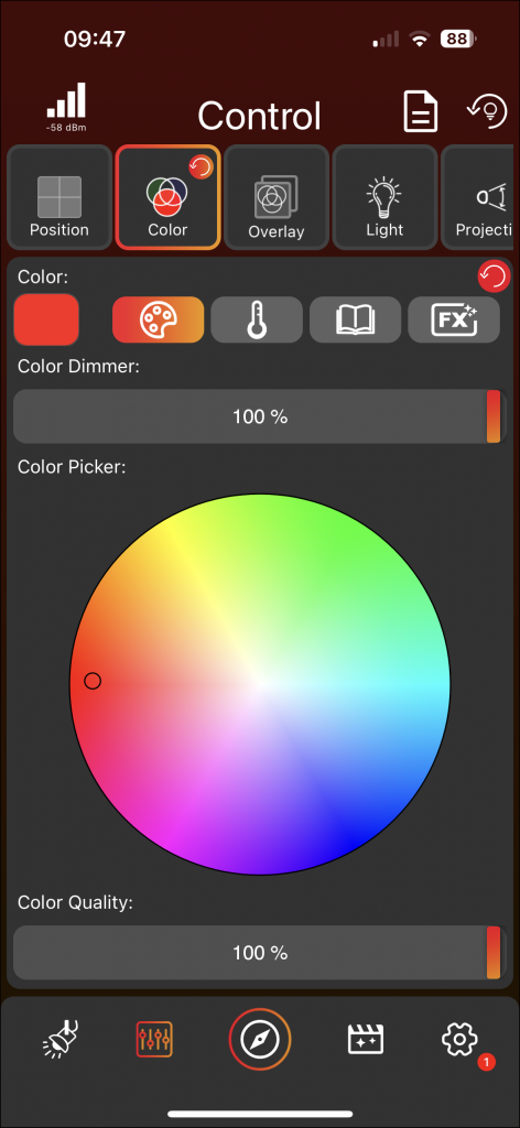
Components Tab View
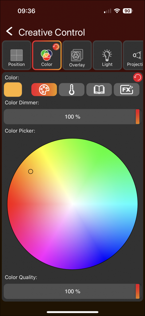
- Click on the top tab view, either on Position, Color, Overlay, Light, Projection, or Special, to access the corresponding views.
- Be aware that there are so many components that the tab view may be scrollable.
- It is very likely that your tab view will not display all the components (Position, Color, Overlay, Light, Projection, and Special), because only the supported components of your fixture will be displayed. You can click on the arrow on the right side of the tab view to see all possible components, but setting a value for a component which your fixture does not support will not change anything on your fixture and is therefore not recommended.
Example: If your fixture only has a white LED, there will be no Color tab, and it would make no sense to set a color because the fixture cannot show the value. - If you have selected a group with different fixtures, all components which are supported by at least one fixture in the group will be displayed in the tab view.
- From there, you can adjust the values using faders, a joystick, a 2D Plane, buttons, a Color Picker, etc. depending on the component.
- These values apply to all selected groups or fixtures on the Lights Page.
- A grey fader cursor indicates a default value, while a fader cursor with a red to orange brush indicates a set value. You always set the value for all selected groups.
Example: If you select Group 1 and set a value, the fader cursor will be in the red to orange brush. If you then deselect Group 1 and select Group 2, and set a value for Group 2, the fader cursor will also be in the red to orange brush. If you then select both Group 1 and Group 2 and their values are different, one fader cursor will be, for example, orange and the other cursor will be yellow, indicating that there are different values. The fader cursor colors for different values can be assigned to the small color triangle in the top left of a group or fixture frame on the Lights Page. If the values had been the same, the fader cursor would be in the red to orange brush. Upon setting a new value, each selected group or fixture adopts this value, turning the fader cursor to the red to orange brush. See all the steps from the example in the image below:

Components Detail Explaination
| Position | Color | Overlay | Light | Projection | Special |
| Position static | Color (static or FX) | Overlay Intensity (static or FX) | Master Intensity (static or FX) | Zoom static | Fog |
| Position FX | Overlay Pattern | White Intensity (static or FX) | Zoom FX | Fan | |
| Overlay Color | Strobe | Focus | |||
| Overlay Strobe |
Each component is categorized within one of the Tabviews, as shown in the table above. Here are brief explanations of the differences between static and FX components:
Position Static vs. FX: The static component can be adjusted using the Joystick, Faders, or a 2D plane, and represents a static value of the fixture’s Position. The FX value can be set using the FX button, where you can select from different movements that the fixture will perform. The FX Position movements are centered around the Position static value. If the Position static value is not set, then it defaults to a standard value.
Zoom Static vs. FX: The static component can be adjusted with the fader and represents a static value of the fixture’s Zoom. The FX value is configured using the FX button, where different Zoom movements can be selected for the fixture to perform. The FX Zoom movements are centered around the Zoom static value. If the Zoom static value is not set, it defaults to a standard value.
Color Static vs. FX: The Color component can be either static or FX, unlike Position or Zoom which have two separate components. The static color value can be set in the Picker, the Temperature, or the Color Book within the Color Tabview. The FX value can be set in the FX section, which includes some FX presets, and by clicking the FX button at the bottom, a new page opens where you can create your own Color FX.
Master Intensity Static vs. FX: The Master Intensity component can be either static or FX, like the color component. The Master Intensity component can be static if it is set with the fader, or FX if it is set using the FX button.
White Intensity Static vs. FX: The White Intensity component can be either static or FX, like the color component. The White Intensity component can be static if it is set with the fader, or FX if it is set using the FX button.
Overlay Intensity Static vs. FX: The Overlay Intensity component can be either static or FX, like the color component. The Overlay Intensity component can be static if it is set with the fader, or FX if it is set using the FX button.
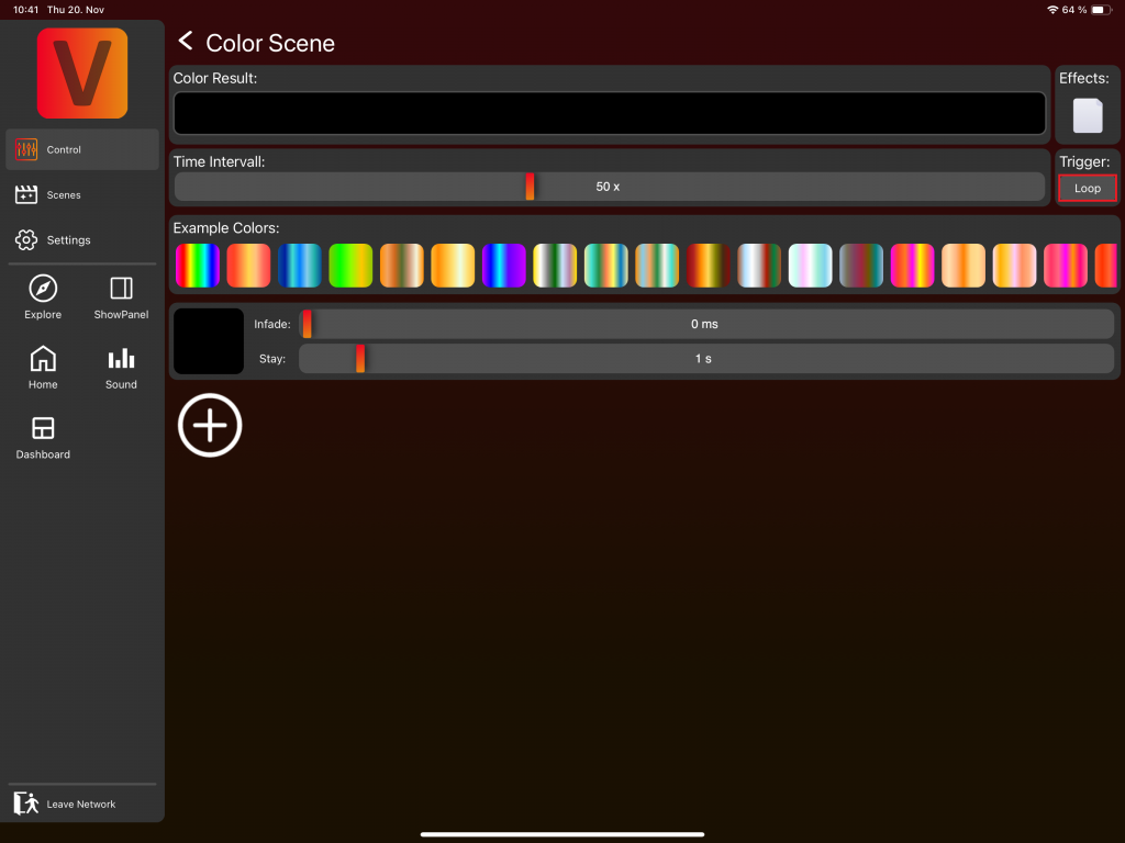
FX Page explained
In the following, the FX Page will be explained in detail using the color components as examples. The explanation for other FX components is very similar, but not exactly the same. Each FX value consists of up to 6 FX Scenes.
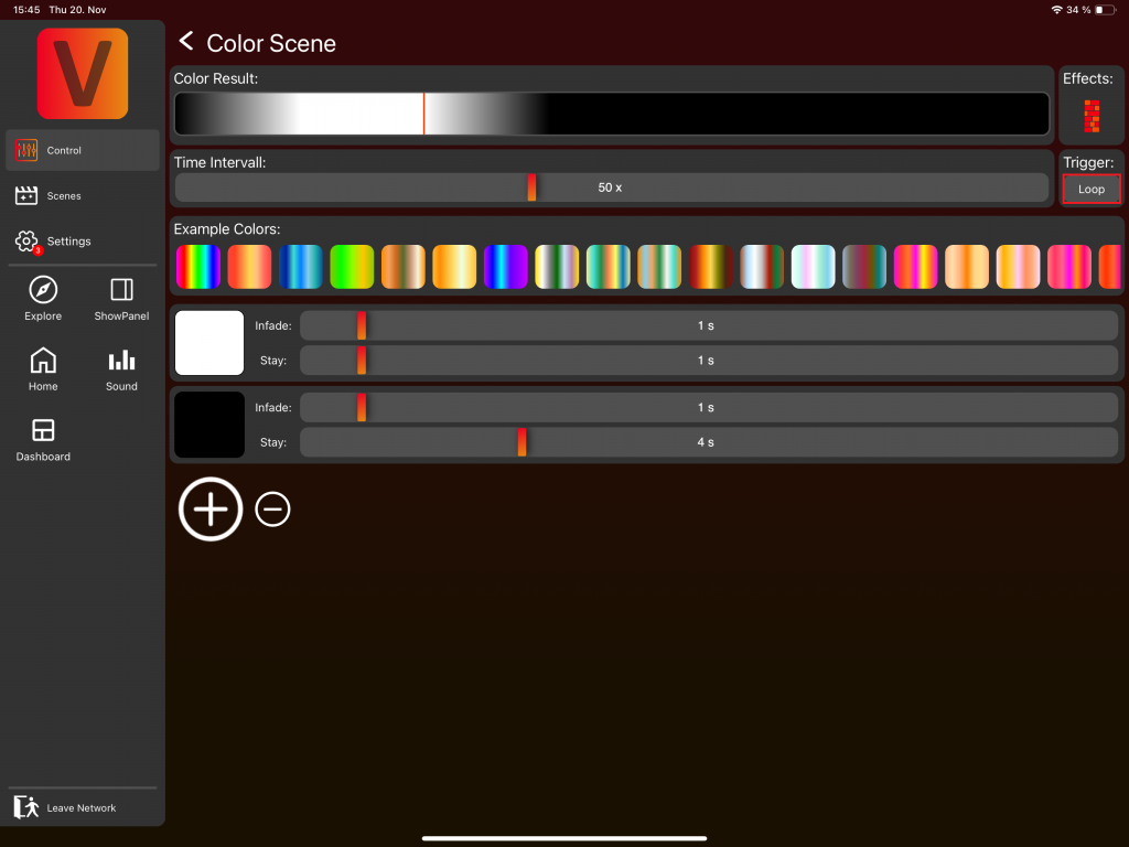
1. Change Color and Dimmer
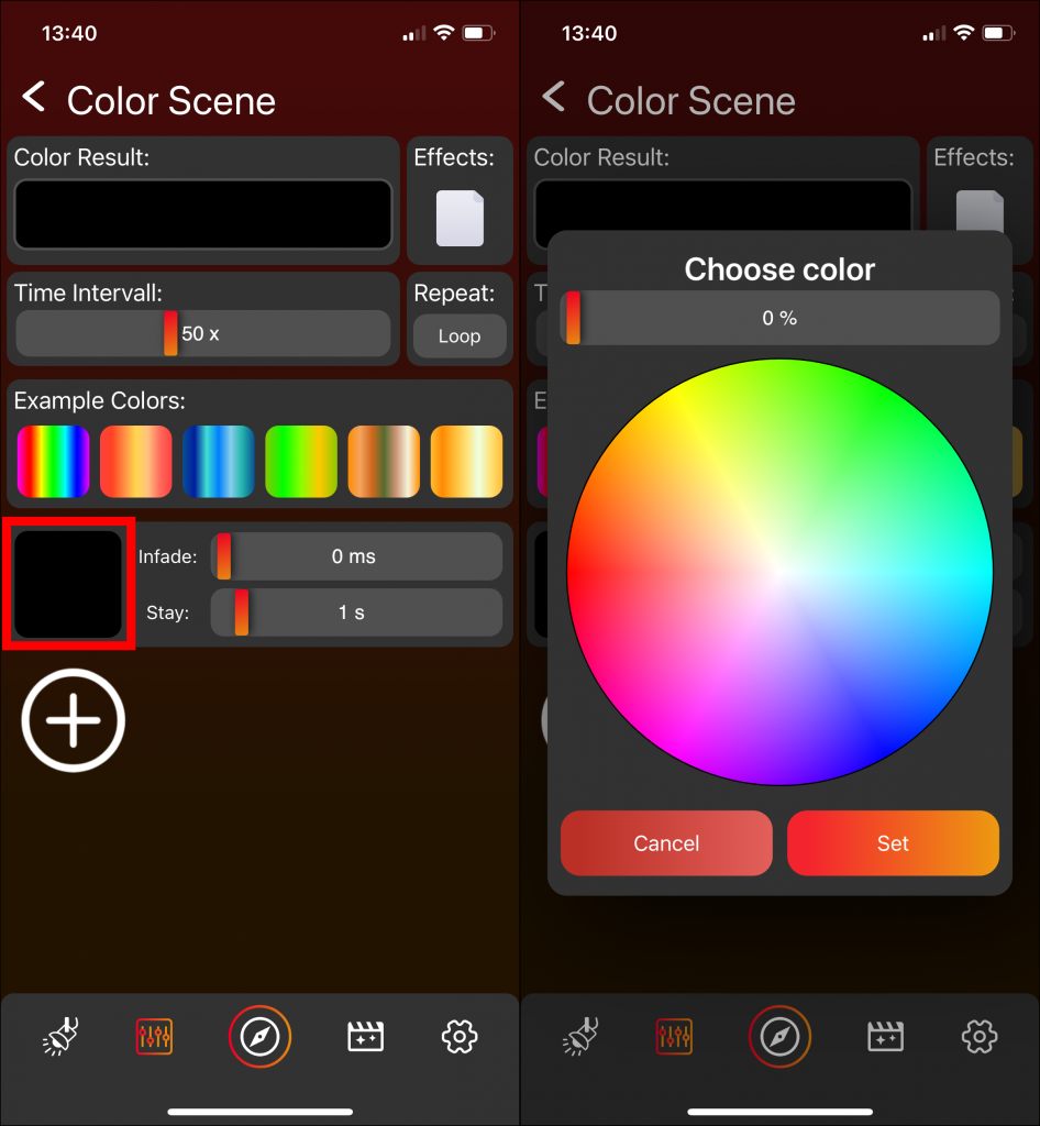
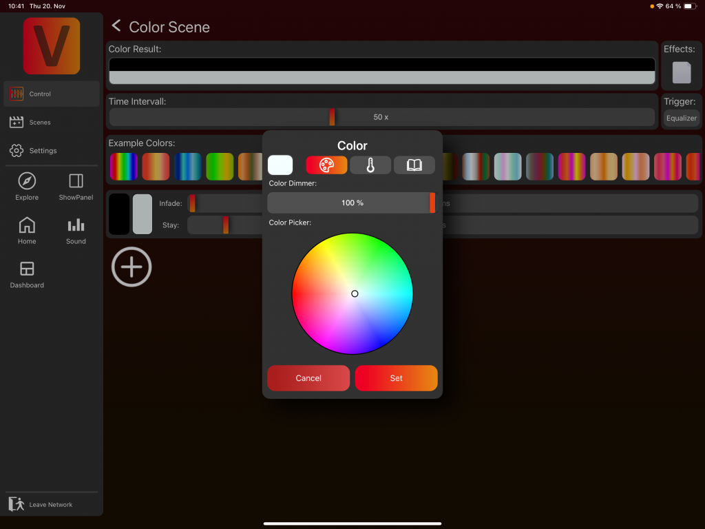
Click on the square on the left to change the color and the dimmer value of the Color FX Scene. A popup opens and you can chose the color and the dimmer value.
2. Change Infade Time and Stay Time
The Infade Time and Stay Time can be changed with the faders of the Color FX Scene. The Infade Time and Stay Time values are relative to the Time Intervall value. For more details see below in chapter „5. Speed“ of FX Page explained.
3. Add further Color FX Scenes

Click the plus Icon to add further Color FX Scenes. A Color FX Value can consists of up to 6 Color FX Scenes.
4. Delete Color
Click the minus Icon to delete the last Color FX Scene.
5. Change Speed
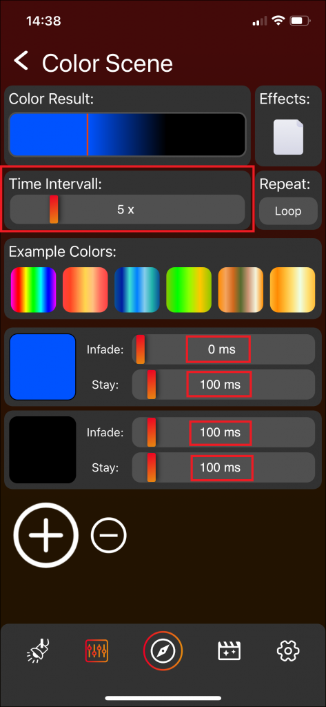
The speed can be adjusted with the Time Intervall Fader. A smaller value indicates a higher speed. Changing the Time Intervall changes as a result the Infade Time and Stay Time of each Color FX Scene.
6. Result
The Color Result on top shows a combination of all the Color FX Scenes and servers an an overview.
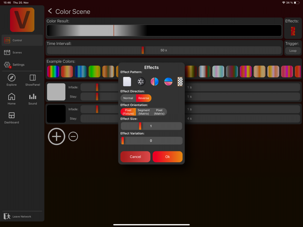
7. Effects
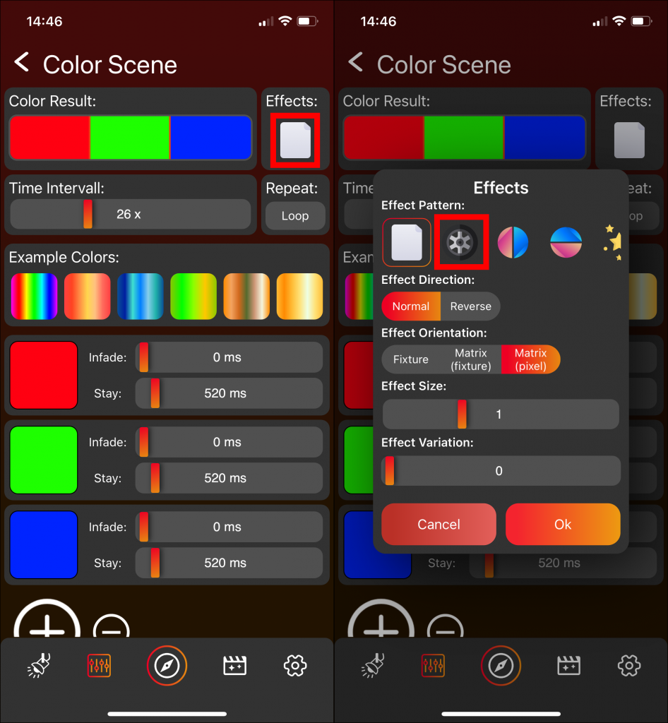
By default, the Color FX Scenes are played sequentially. For example, the fixtures display red for 520ms, then green for 520ms, followed by blue for 520ms, before it restarts. When you click on Effects and select something other than the empty paper from the Pattern menu, the configuration becomes more complex. To fully explore the various possible outcomes, it’s important to control a group with more than one fixture, a configurated matrix and each fixture should be capable of single-pixel control.
For instance, the pattern „Wall“ stretches the Color FX Scenes across the available space on the fixture or matrix, depending on the Effect Orientation selection:
- Pixel (Fixture): Each fixture separately displays a moving red, green, and blue wall.
- Pixel (Matrix): All fixtures together form a matrix that displays one large red, green, and blue wall, with each pixel individually controlled.
- Segment (Matrix): All fixtures together form a matrix that displays one large red, green, and blue wall, with all pixels of each fixture controlled as a single unit.
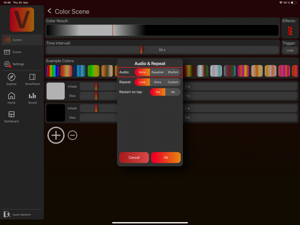
8. Repeat
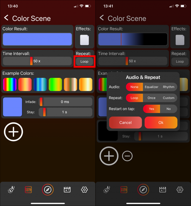
Here the repeat count can be set. The default value is a loop. How to create audio effects is explained below in the chapter „Sound Effects„.
9. Example Colors

Here it is possible to select from on of the example FX Color Scenes.
Sound Effects
This section explains how to create your custom sound effect. The example uses the Color component, but you can create a sound-based effect with any component that provides FX options, such as Master Intensity, Zoom, and others.
Creating a Volume/Amplitude-Based Color Sound Effect
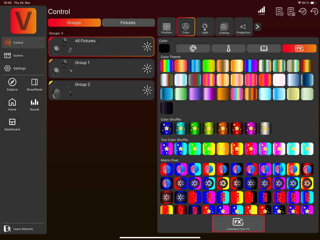
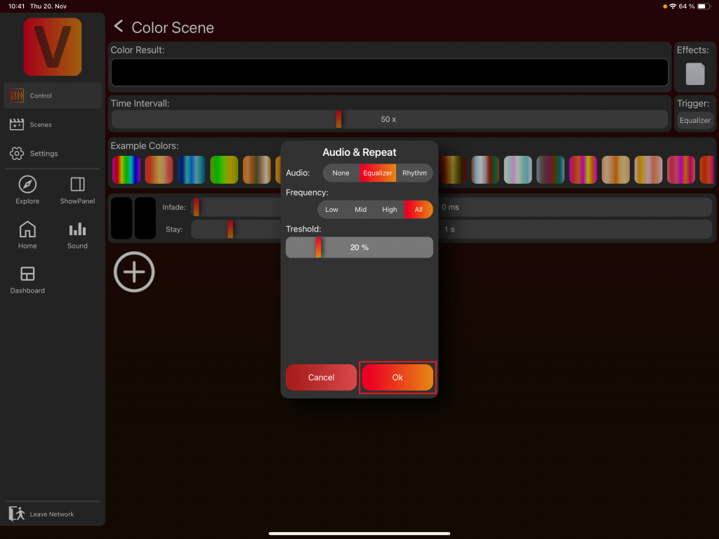
- Navigate to Customize Color FX:
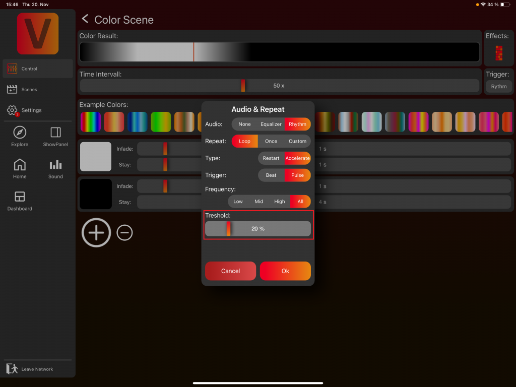
2. Click on the trigger „Loop“. A popup will appear.
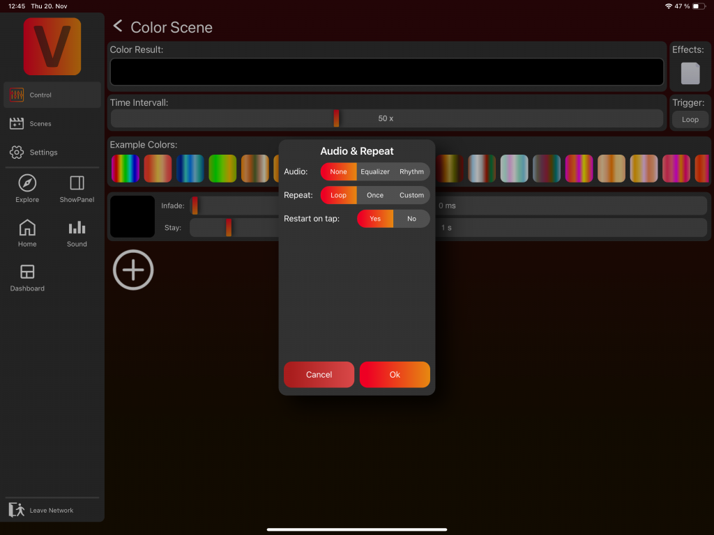
3. Select Equalizer to create a volume-based sound effect.
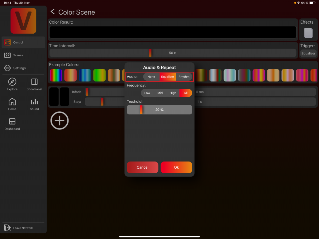
4. Choose the frequency range you want to react to:
- Low (Bass)
- Mid (Midrange)
- High (Treble)
- Or the full frequency band
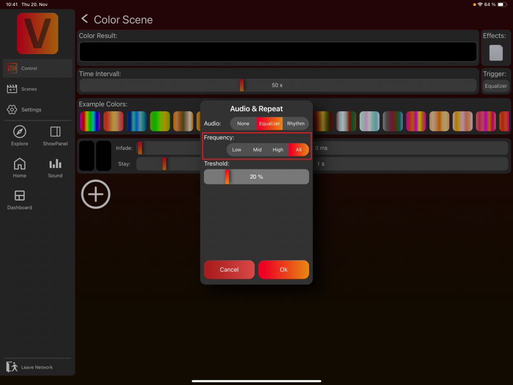
5. Set the volume threshold. A value of 20% is a good default value.

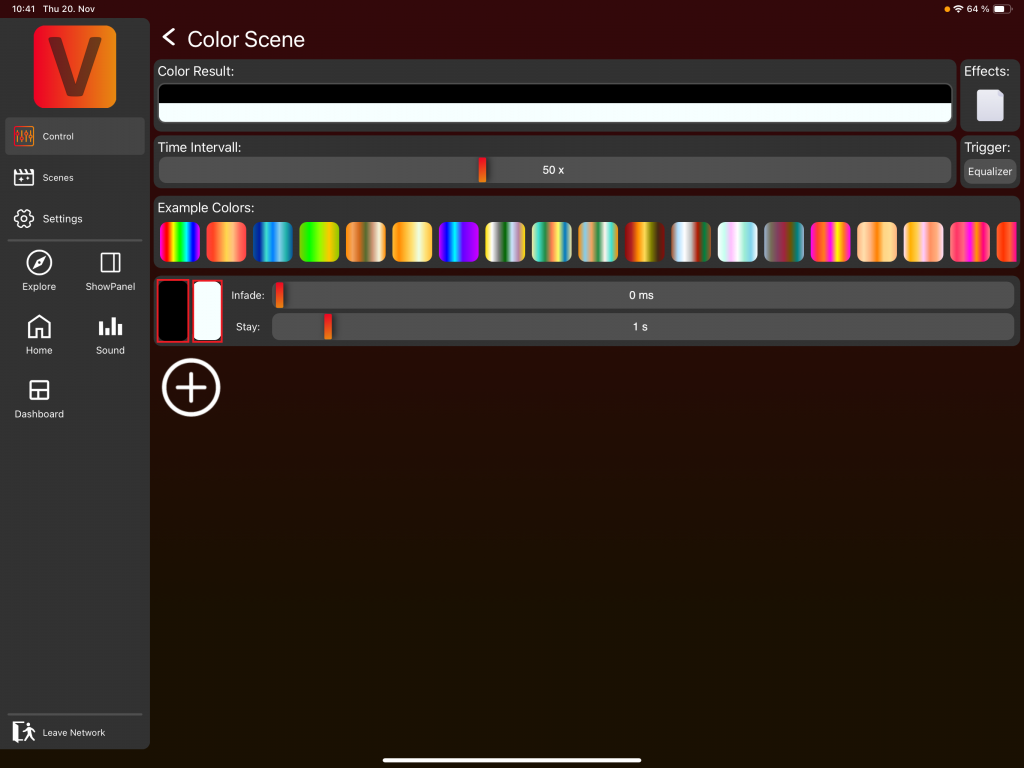
6. Close the popup:
7. Select a minimum color and a maximum color
In this example, we set:
Minimum Color: Black (off)
Maximum Color: White
How It Works:
The app continuously measures the volume over the last 20 seconds and determines the range between the lowest and highest detected values.
The effect starts with its minimum color once the volume reaches the defined threshold.
This means in the example:
– At 0–20% volume, nothing happens (below threshold).
– Just above 20%, the minimum color is shown.
– At 100%, the maximum color is shown.
– Everything in between results in a mixture of the minimum and maximum color
You can make the effect more advanced by using multiple FX scenes.
For example:
- Scene 1: Black → Green (5-second stay time)
- Scene 2: Black → Blue (5-second stay time)
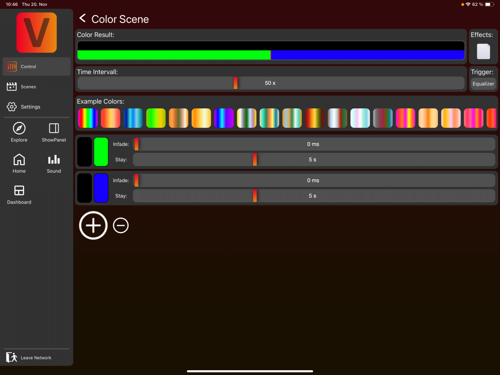
The effect will behave as follows:
- During the first 5 seconds, the color transitions from black to green based on the volume.
- During the next 5 seconds, it transitions from black to blue based on the volume.
Obviously, the minimum color doesn’t need to be black — it can be any color. That was just an example. You can create even more complex effects using additional FX settings you already know from building standard FX.
Creating a Rhythm-Based Color Sound Effect
- Navigate to Customize Color FX:
2. Create your base dynamic effect.
In this example, we build a simple wall effect using a short white scene followed by a longer black scene, and select Wall Effect in the FX popup. This results in a basic wall animation moving from left to right.
3. Click on the trigger „Loop“. A popup will appear.
4. Select Rhythm to create a rhythm-based sound effect.
5. Choose a repeat count. Typically, you select Loop for an endless repeating effect.

6. Define the trigger type:
Restart: The effect restarts from the beginning when triggered by sound (Beat or Pulse). In our example, this means that the wall effect will restart from the beginning, with the white section positioned on the left side of the fixture.
Accelerate: The effect briefly speeds up when triggered by sound (Beat or Pulse). In our example, this means that the wall effect will move faster for a short period of time

7. Choose the Trigger:
Beat: Detects repeating beat patterns in the music and triggers in the rhythm of the identified beat.
Pulse: Reacts to individual audio pulses/peaks.

8. Select the frequency range the effect should respond to:
Low (Bass)
Mid (Midrange)
High (Treble)
Full Band
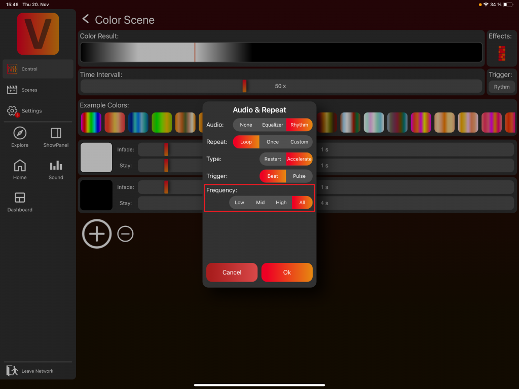
9. If you selected Pulse, set the volume threshold. A value of 20% is a good default.
You can create more complex sound-reactive effects by combining these settings with additional FX options you already know from designing other effects.
Reset Specific Component
When a component is set, small red/orange circles with a reset icon appear.
For example, if you set a color, a reset button appears:
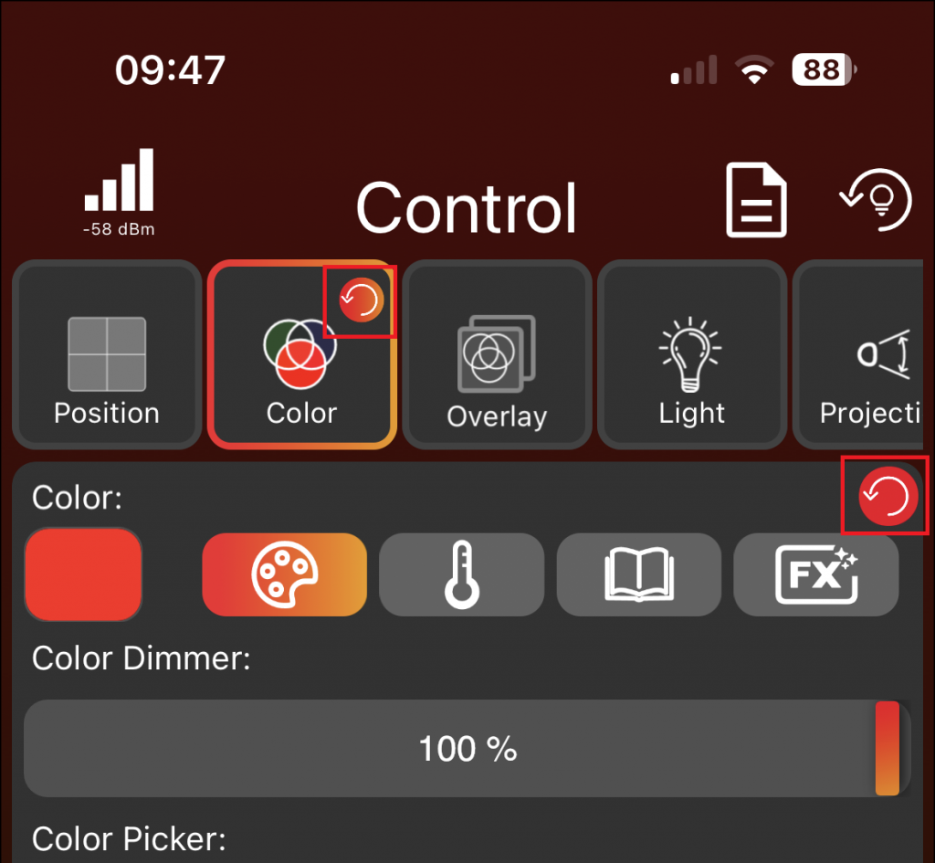
Click the reset circle, as shown in the image above, to reset only the Color component for all selected groups and fixtures. In the Color Tabview, both reset icons in the image perform the same function because the Tabview Color consists only of the Color component. In the Overlay Tabview, for example, it is different because there are multiple components: Overlay Intensity, Overlay Strobe, Overlay Color and Overlay Pattern. The reset icon in the Overlay Tabview will reset all Overlay components, and the reset icon close to a component itself resets only that specific component, like for example Overlay Intensity.
Scenes Page
Page Division:
- The Scene page is categorized into „Local“ and „Network.“
- „Local“ denotes storage on your local device, such as a phone or tablet.
- „Network“ denotes storage in the cloud related to the current network, requiring an internet connection. This allows seamless transition between devices and enhances collaboration, as another user can connect to the network and access all Scenes & Sequences.
- Creating, editing, or deleting Scenes & Sequences functions identically in both Local and Network modes.
Edit Mode:
- Access edit mode by clicking the edit pencil located at the top of the page.
- Deactivate edit mode by clicking the checkmark at the top.
- The edit mode will enable features for the folder, scene and sequence items, which will be explained in detail below. Moreover, it allows the creation of new scenes, sequences, or folders by clicking the Plus Icon.
Folder Item
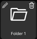
- To view the contents of a folder, click on the folder itself.
- While in edit mode, you’ll find a trash bin icon at the top right of the folder item, allowing you to delete the folder. Note that all items within the folder must be deleted first.
- While in edit mode, you’ll find a edit pencil icon at the top left of the folder, enabling you to rename the folder.
- While in edit mode, you’ll find a rubbish bin icon at the top right of the folder, enabling you to delete the folder.
- Within a folder, additional Scenes, Sequences, or Subfolders can be organized.
Scene and Sequence Item
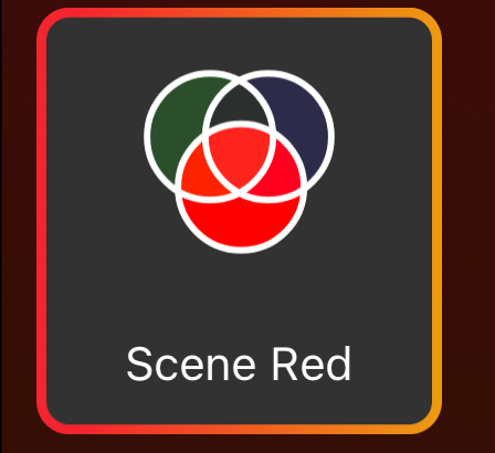
- Click on a Scene Item or Sequence Item to activate it. Click again to deactivate it.
- While in edit mode, clicking on a scene or sequence item allows you to access more detailed information and make changes to them.
- Consists of the name of the sequence or scene.
- In the center of the scene or sequence item, there are bubbles representing components of a scene or sequence. The same bubble may appear multiple times if there are several fixtures or groups with this component in the scene or sequence.
- Scenes and sequences can have a „Blank“ icon in the bottom left, indicating that the option to „leave blank“ for unused components was selected in this scene or sequence. Further explanation regarding unused components can be found in the „Create Scenes“ section.
- A sequence item can be distinguished from a scene item by the presence of a play icon in the bottom right corner.
- While in edit mode, you’ll find a rubbish bin icon at the top right of the item, enabling you to delete the scene or sequence.
Create Scene
- Begin by navigating to the light page (mobile layout) or control page (Desktop Layout) and selecting the groups or fixtures that should be part of the scene.
- Move to the control page and set the desired components for the selected groups or fixtures.
- Afterward, click the edit pencil to activate the edit mode. Then click on the plus icon and choose „Scene.“
- The groups and fixtures, along with their respective components, will appear at the bottom of the page in frames. If you click on the small components Icons (Bubbles) within a frame, you can delete them. If a group or fixture has no more components, it will be removed.
- In case you accidentally remove a component, fixture, or group altogether, you can click the “Restore“ button to set the components back to their initial state.
- If you want to make further adjustments to the components or the chosen groups and fixtures, return to the control page, modify the values as needed, and then go back to the scene page. Click the „Update“ button to load the updated status of the control page into the scene.
- Add a name for the scene.
- Set an infade time using the fader or click the „Set“ button to enter the infade time in seconds.
- Decide the trigger of the scene:
- Set: The scene can be activated with a click and will remain active until it is deactivated by clicking again.
- Flash: The scene remains active only while the scene button is pressed. As soon as the button is released, the scene is deactivated. This feature is particularly useful for strobe & shutter Scenes that need to be activated temporarily at specific moments.
- Decide what happens with unused components:
- „Set default“: Saves the default values of unused components in the scene.
- „Leave blank“: Does not save unused components in the scene.
- „Custom“: A bubble for each component will appear. You can decide what happens to each component individually. If the bubble is selected it is equivalent to „Set default“ if the bubble is deselected it is equivalent to „Leave blank“.
- Example 1: Save a scene with Pan and Tilt movement, selecting „Set default.“ Reset all groups and fixtures, set the intensity dimmer to 100%, then trigger the scene with Pan and Tilt movement. The fixtures will stop emitting light and perform the pan-tilt movement because the light intensity is saved as the default value in the scene, which is 0.
- Example 2: Save a scene with Pan and Tilt movement, choosing „Leave blank.“ Reset all groups and fixtures, set the intensity dimmer to 100%, then trigger the scene with Pan and Tilt movement. The fixtures will still emit light and perform the pan-tilt movement. The Intensity component is not saved within the scene, and therefore, it remains unchanged.
- Finally, click the save icon at the top to complete the process.
Create Sequence
- Provide a name for the sequence.
- Determine the frequency of repetition for the sequence.
- Specify an overall in fade time for the initial triggering of the sequence.
- Decide the trigger of the sequence:
- Set: The sequence can be activated with a click and will remain active until it is deactivated by clicking again.
- Flash: The sequence remains active only while the sequence button is pressed. As soon as the button is released, the sequence is deactivated. This feature is particularly useful for strobe & shutter sequence that need to be activated temporarily at specific moments.
- Decide the handling of unused components (similar to unused components in scenes).
- There are two ways to add scenes to a sequence:
- Add a scene from already created scenes:
- The Scene page opens and you can select the desired scene. After selection, a popup will appear asking whether to ‚Link Scene‘ or ‚Copy Scene‘. Choosing ‚Copy Scene‘ will create a duplicate of the original scene, any changes made to the original will not affect the copied scene in the sequence. On the other hand, selecting ‚Link Scene‘ creates a link to the original scene, meaning any modifications to the original scene will also be reflected in the sequence.

- Add the current groups or fixtures and there components of the Control and Lights Page as a new scene:
- A new page opens where you create a new scene. Click on the save Icon. This scene will only be saved within the sequence.

- Add a scene from already created scenes:
- Repeat the process to add more scenes, with a maximum limit of six scenes in a sequence.
- Click on each scene within the sequence to adjust the infade and stay time. Note that the infade time is separate from the stay time. For example, with a 2-second infade and a 5-second stay time, the scene will fade in over 2 seconds and then stay for 5 seconds. Click „Save“ at the top to confirm and save your changes. You can also navigate back using the arrow on the top left, but this won’t save your changes.
- Use the rubbish bin icon to delete a scene from the sequence.
- Utilize the arrows on the right to change the order of the scenes within the sequence.
- Click „Save“ to store the sequence.
- It’s important to note that scenes within a sequence are linked to the original scenes. Consequently, any modifications or deletions to the original scene will reflect in the linked scene within the sequence. A warning popup will appear if you attempt to delete a scene linked in a sequence.
Scene and Sequence Activation:
- Click on a Scene Item or Sequence Item to activate it.
- An active Scene or Sequence is indicated by a yellow border.
Clicking again deactivates the Scene or Sequence.
If there are similar scenes and sequences than it can occur that several scenes and sequences have a yellow border.
An example of the activation and deactivation logic when the setting for unused components is set to „set default“ in a scene is:
- Scene 1 is configured with a dimmer value of 100, while the other components are set to “set default”.
- Scene 2 is configured with a pan value of 100, while the other components are set to “set default”.
- Activate Scene 1 by clicking on it, and the fixture will illuminate at maximum brightness. Additionally, Scene 1 will be highlighted with a yellow border.
- Activate Scene 2 by clicking on it to initiate the pan position. The fixture will stop illuminating and will move to its designated pan-tilt position. Only Scene 2 will be active and highlighted with a yellow border.
- Click on Scene 2 to deactivate it the fixture will return to its default pan position and none of the scenes will be active.
An example of the activation and deactivation logic when the setting for unused components is set to „leave blank“ in a scene is:
- Scene 1 is configured with a dimmer value of 100, while the other components are set to “leave blank”.
- Scene 2 is configured with a pan value of 100, while the other components are set to “leave blank”.
- Activate Scene 1 by clicking on it, and the fixture will illuminate at maximum brightness. Additionally, Scene 1 will be highlighted with a yellow border.
- Activate Scene 2 by clicking on it to initiate the pan-tilt position. The fixture will still illuminating at maximum brightness and will move to its designated pan-tilt position. Scene 1 and Scene 2 will be active and highlighted with a yellow border.
- Click on Scene 2 to deactivate it the fixture will return to its default pan position. But the fixture will still illuminate because the dimmer component is not reset, Scene 1 will continue to be highlighted with a yellow border.
- Click on Scene 1 to deactivate it. The fixture will stop illuminating, and none of the scenes will be active.
When you activate a sequence and navigate to the lights page, you will notice that the bubbles below the corresponding groups or fixtures display a yellow play symbol at the bottom right. This symbol indicates that a sequence is currently active. The bubble icon itself represents the last scene of the sequence.

Settings Page
Network
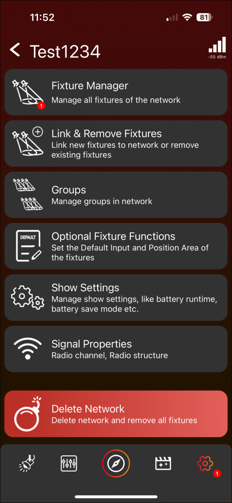
Fixture Manager
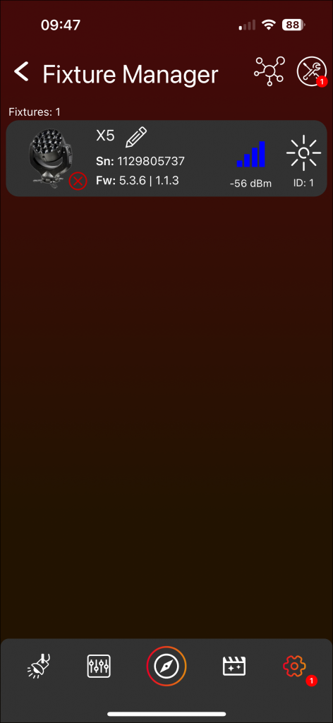
- Access the Fixture Manager to view all network fixtures.
- A red-bordered Fixture Frame indicates a non-responsive fixture. Possible reasons could be:
- Fixture is turned off.
- Fixture is too far away.
- Fixture was unlinked.
- In Mobile Layout, swipe down to initiate fixture rescanning and in Desktop Layout, press the Refresh button (with two arrows) at the top.
- The Tools Icon (wrench and spanner) opens a popup for Fixture Updates and RDM Manager. The functions in the popup apply to all fixtures in the network. Vision Update is not possible here due to fixtures being interconnected via Vision. Execute Vision updates on the discover page using the Tools Icon. In the discover page the fixture is connected via Bluetooth. Therefore, you have to leave the network.
- The network Icons (circles which are connected) at the open will restructure the network. Exercise caution, as this is an advanced feature. Please review the information below before proceeding with the restructuring. This process will modify the network’s structure and will eliminate fixtures that are currently unavailable. Fixtures linked to this network, but currently not available, will no longer function within the network. If you initiate the restructuring and these fixtures become available again, they have the potential to cause problems. This is due to the existence of two networks – the „main“ network with fixtures that were available and a „separate“ network with fixtures that were not available during the restructuring. Here are two options to resolve this issue:
- If you wish to reintegrate these fixtures into your „main“ network, perform a new restructure. The network will be effectively „healed,“ and these fixtures will be added back into the network.
- If you prefer not to include these fixtures in your „main“ network and want to ensure they don’t cause any issues, either physically unlink them from the fixtures themselves or delete their „separate“ network.“
- Click on a Fixture Frame for a detailed page similar to clicking on a fixture in the Discover Page.
- Click the name or the edit pencil to rename a fixture. Renaming fixtures is a beneficial feature if you wish to view them in a specific order, as they will be presented alphabetically on the Light Page.
- Use the Sun Icon to highlight or stop highlighting a fixture.
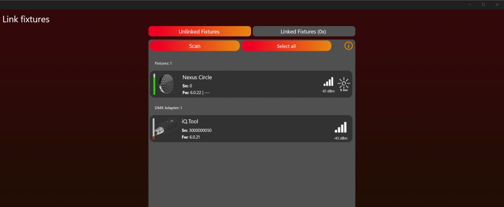
Link & Remove Fixtures:
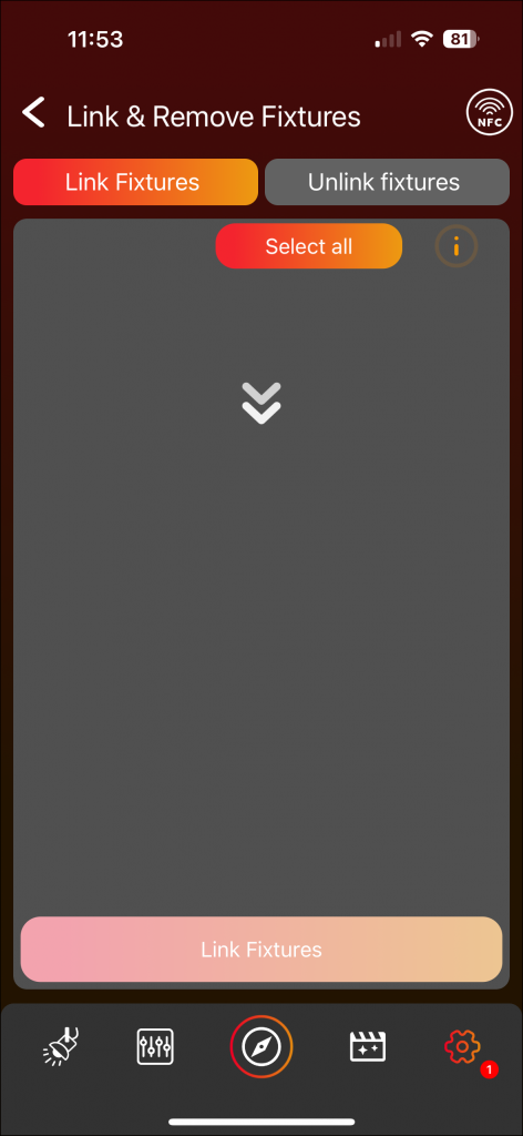
- The left tab displays unlinked fixtures, and the right tab shows linked fixtures.
- In the unlinked fixtures tab, scan for available fixtures by swiping down in Mobile Layout or pressing the „Scan“ button in Desktop Layout.
- Highlight a fixture by clicking the sun icon for easy identification.
- Select fixtures for linking, then click „Link fixtures.“ A popup shows the linking process.
- At the end a popup shows the results for each fixture. To obtain more information, click on the fixture. This is especially beneficial in situations where the linking process might not have been successful.
- After clicking „Close,“ an automatic scan will initiate, allowing the addition of further fixtures to the network.
- In the Linked fixtures tab, already linked fixtures are displayed. To remove fixtures, select them and use the remove button at the bottom.
- To remove a fixture, an active connection to the fixture is required.
Groups
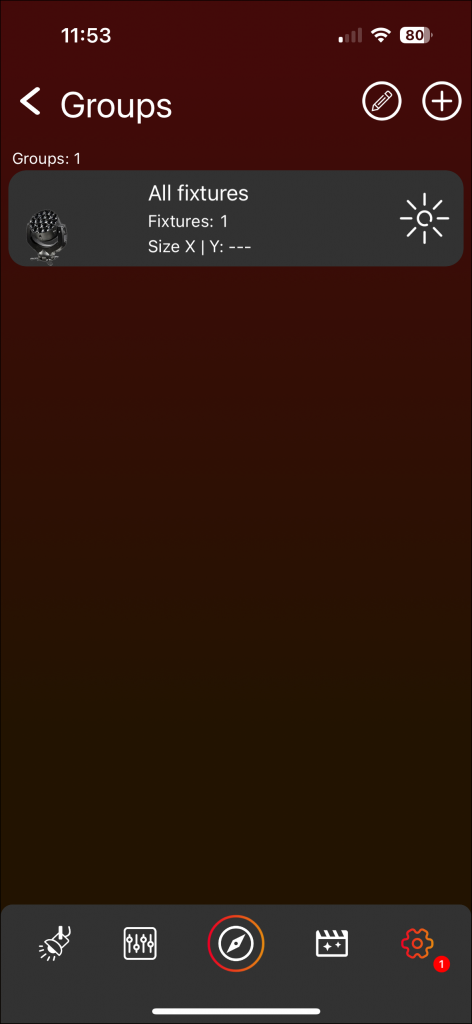
- The „All fixtures“ group is auto-created for easy control and cannot be deleted.
- Add a new group by clicking the plus icon in the top.
- Enter a name, select fixtures, and create the group by pressing „Add.“
- A popup will then appear asking if you wish to position the fixtures in your group. We strongly recommend doing so to enable powerful matrix effects.
- Create up to 7 groups.
- Click on a group frame to add/remove fixtures and to Position them. For the „All fixtures“ group it is not possible to add/remove fixtures you can only Position them. We strongly recommend doing so to enable powerful matrix effects.
- Position Fixtures:
- Unlock the power of matrix effects by positioning your fixtures within a 2-dimensional space.
- Select a geometric shape from the Popup and fill in information like horizontal and vertical fixture count if necessary
- Simply click on a fixture to highlight it, and then use drag and drop to place it. The available area is defined by the orange rectangle. This can be enlarged or reduced by dragging the orange line on the right or bottom.
- The button at the top, labeled ‚Shape‘, provides the opportunity to change the selected shape.
- The thin gray lines serve as positioning guides and center the fixtures placed within them. These guidelines can be activated or deactivated using the respective sliders at the top. If the vertical and horizontal guide lines are deactivated, the fixtures can be positioned freely without automatically centering between lines. By clicking on the number or line grid symbol at the top, the distance between the lines can be adjusted.
- If a circle is chosen as the shape, an additional offset for the degree line can be defined with the button in the top left corner.
- Furthermore, there is the option to rotate the fixtures. The red dot, positioned near the fixture, serves as a guide for the rotation and is located at the top left of the fixture when there is no rotation. To rotate a fixture, double-click on it. Then, a popup appears where the desired clockwise rotation in degrees can be chosen.
- Click the edit pencil at the top to enable the edit mode. Utilize the rubbish bin icon to delete a group, or click the edit pencil next to the group name to rename it.
Optional Fixture Functions
Position Area
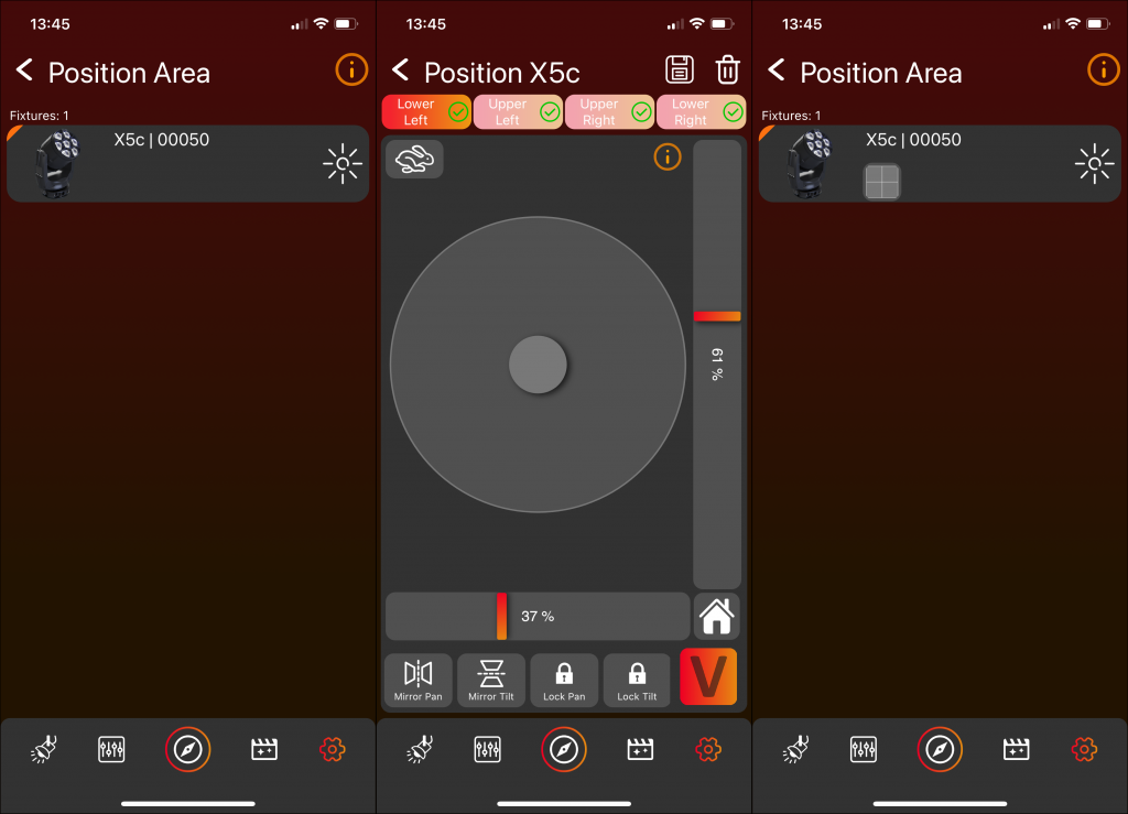
- Utilize the position area feature to define the movement range of your fixture.
- Initiate by selecting the fixture for which you intend to set a Position Area. If a fixture has an already defined Position Area, a Position Bubble will be shown below the fixture’s name.
- Define the position area by setting four points; click on each tab view to set the points.
- The active point is highlighted with a brighter tab view and receives a green checkmark.
- Save the position area configuration using the save icon at the top.
- To delete the position area configuration, click the rubbish bin icon at the top.
Default Input

- Employ the Default Input feature to establish a preset value to which the fixture will automatically move.
- Start by clicking on the fixture for which you wish to set a Default Input. If a fixture has an already defined default input value it will be shown below the fixture’s name:
- A Pan default input value will display a Position Bubble with a horizontal line
- A Tilt default input value will display a Position Bubble with a vertical line
- A Zoom default input value will display a Zoom Bubble
- Specify the Pan, Tilt, and Zoom values accordingly.
- Activate the feature using the On/Off switch and adjust the values using the fader.
- Save the default input configuration using the save icon at the top.
- To delete the default input configuration, click the rubbish bin icon at the top.
- Attention: When configuring both the Position Area and Default Input (Pan or Tilt) for a fixture, it is important to set the Position Area before defining the Default Input. This sequencing is crucial as the Default Input is relative to the available area for the fixture. If the Default Input is set before the Position Area, the Default Input may change after configuring the Position Area.
FX Range
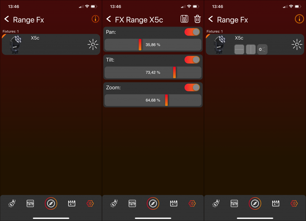
- Use the FX Range feature to set a limit on the FX Range. By default, the FX Range is set to 100%. You can decrease this value to restrict the range of the FX effects applied to the respective component (Pan, Tilt and/or Zoom).
- Start by clicking on the fixture for which you wish to set a FX Range. If a fixture has an already defined FX Range value it will be shown below the fixture’s name:
- A Pan FX Range value will display a Position Bubble with a horizontal line
- A Tilt FX Range value will display a Position Bubble with a vertical line
- A Zoom FX Range value will display a Zoom Bubble
- Specify the Pan, Tilt, and Zoom values accordingly.
- Activate the feature using the On/Off switch and adjust the values using the fader.
- Save the FX Range configuration using the save icon at the top.
- To delete the FX Range configuration, click the rubbish bin icon at the top.
Invert
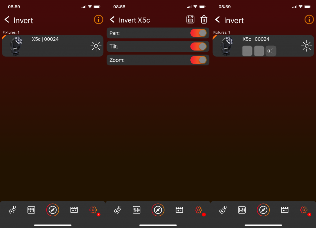
- Use the Invert feature to invert the fixtures pan, tilt or zoom values.
- Start by clicking on the fixture which you want to invert. If a fixture has an already inverted value it will be shown below the fixture’s name:
- A inverted Pan value will display a Position Bubble with a horizontal line
- A inverted Tilt value will display a Position Bubble with a vertical line
- A inverted Zoom value will display a Zoom Bubble
- Specify the Pan, Tilt, and Zoom values accordingly.
- Activate the feature using the On/Off switch.
- Save the Invert configuration using the save icon at the top.
- To delete the Invert configuration, click the rubbish bin icon at the top.
Show Settings
Here you can manage various settings for the fixtures in the network. It can be possible that you do not see all of the listed settings below then you fixtures do not support this feature:
- Minimum Runtime: You can set a minimum runtime for battery fixtures, ensuring they perform and provide light for the specified duration. To achieve this guaranteed runtime, it can be possible that the overall output of the fixtures is reduced.
- Anti-Theft Mode: If Anti-Theft Mode is turned on, fixtures will light up in a blue and red police effect when they are moved.
- Emergency Mode: You can activate the Emergency Mode for battery fixtures. If Emergency Mode is turned on, fixtures will light up white when power supply is cut off.
- Turn on all fixtures: Turns on all fixtures in the network that support wake up.
- Turn off all fixtures: Turns off all fixtures in the network. Be careful not all fixture types can be turned on again via the app they need to support wake up.
- Activate Standby Mode: Sets all fixtures in Standby Mode.
Signal Properties
Here you can analyze signal properties in detail.
Delete Network
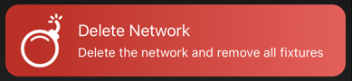
This action deletes the network and removes all fixtures associated with it.
Help
- This section is designated for future inclusion of help videos.
- Please note that the help videos are currently under development and will be added later.
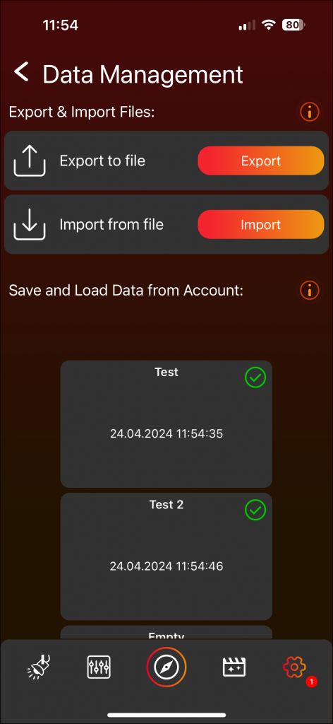
Data Management
- Export to File:
- Click on „Export.“
- Ensure that the checkmark for scenes and sequences is selected.
- Click „Export“ to generate a file containing the scenes and sequences.
- Import from File:
- Click on „Import.“
- Choose the desired file for import.
- Scenes and sequences from the selected file will be imported.
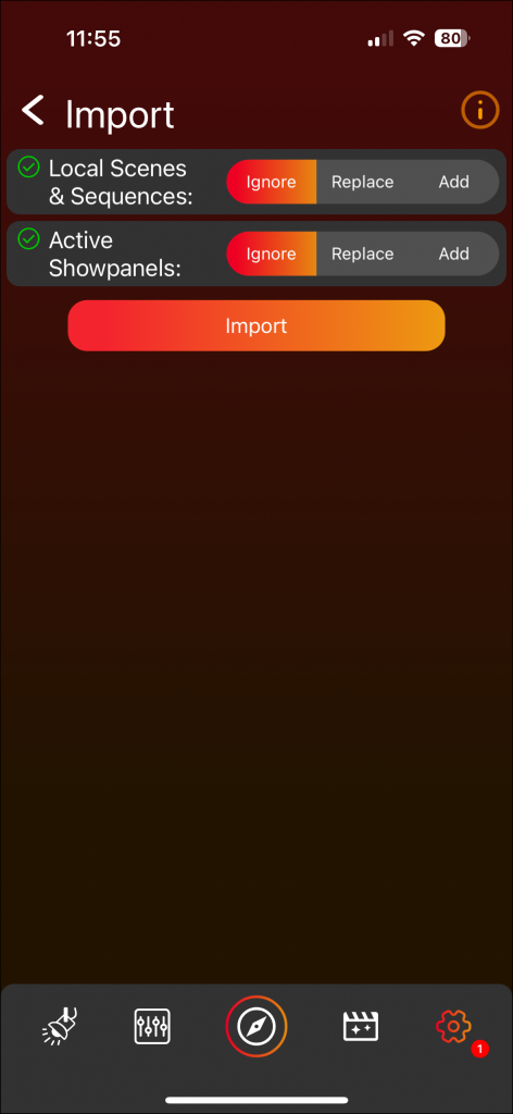
- Add“: Integrates scenes and sequences from the stack in addition to the existing scenes and sequences on the Scene Page.
- „Replace“: Substitutes the current scenes and sequences on the Scene Page with those from the stack.
- „Ignore“: Excludes scenes and sequences from the stack, retaining only the existing scenes and sequences on the Scene Page (Note: Relevant in the Vision App where more than scenes and sequences can be saved.)
- Saving and Loading Scenes & Sequences with your Account (Cloud):
- To save scenes and sequences within your account, click on one of the ten empty stacks at the bottom of the page.
- Click „Upload“ and assign a name to the stack.
- The green checkmark on the stack signifies similarity to your current scenes & sequences.
- To modify the saved data, select the stack and click „Override Saved Data.“ This action will update the stack with your current scenes and sequences, replacing the previous data.
- To load the data from this stack to the Scene Page click „Load saved data“.
- “Add“: Integrates scenes and sequences from the stack in addition to the existing scenes and sequences on the Scene Page.
- „Replace“: Substitutes the current scenes and sequences on the Scene Page with those from the stack.
- „Ignore“: Excludes scenes and sequences from the stack, retaining only the existing scenes and sequences on the Scene Page (Note: Relevant in the iQ.Control App where more than scenes and sequences can be saved.)
- Green checkmark indicates similarity, while an orange warning signifies a divergence.
Library
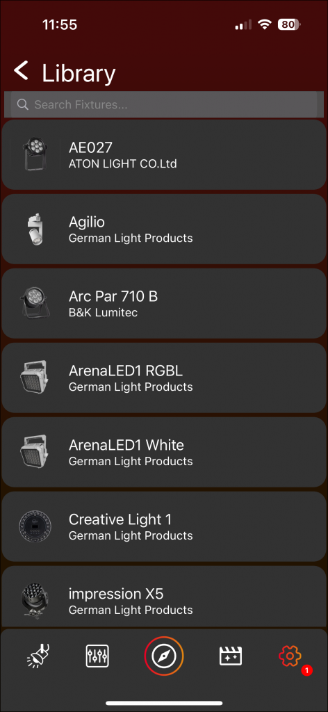
- Access the library showcasing all supported fixtures.
- Click on a fixture to obtain more detailed information.
- Click „Website“ to be directed to the website.
- Click „Release Notes“ to download a document containing release notes.
App Settings
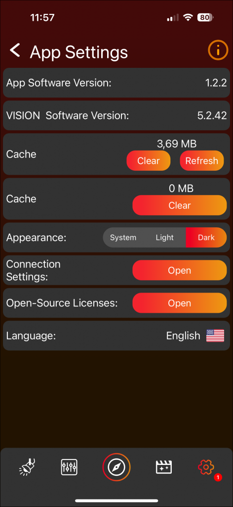
- View the current App Software Version.
- Check the Vision Software Version available for this app.
- Activate Developer Mode by double-clicking on the version number, confirming with „Ok“ in the popup, and entering the code 7248. This mode is intended for developers or specific test cases—avoid casual usage.
- Access information about Library Data, which can be cleaned and refreshed.
- Modify the Appearance (App Theme Mode) to light mode, dark mode, or system mode (synced with your system’s mode).
- Open Connection Settings to adjust MTU Size and Ble Scan Time by clicking on the frame.
- Attention: Changing Connection Settings is for advanced users; exercise caution when making changes.
- Toggle the option to enable or disable diagnostic data for developers. We strongly advise enabling this setting as it provides us with more detailed information in the event of app crashes and troubleshooting.
- There is a summary of open-source licenses utilized in the application. Click open to see more detailed information.
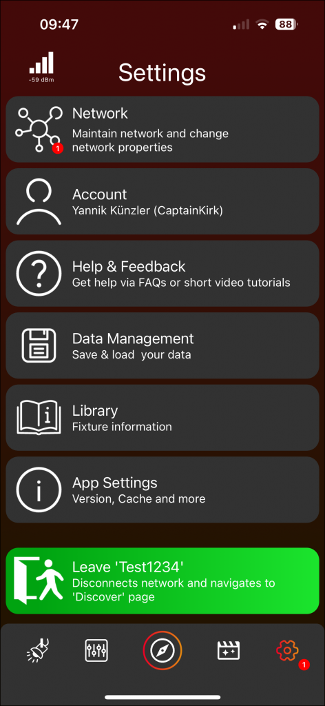
Leave Network

- Click to exit the network and return to the Discover Page. Then the network becomes accessible to other users as well.
Special Pages
Explore Page
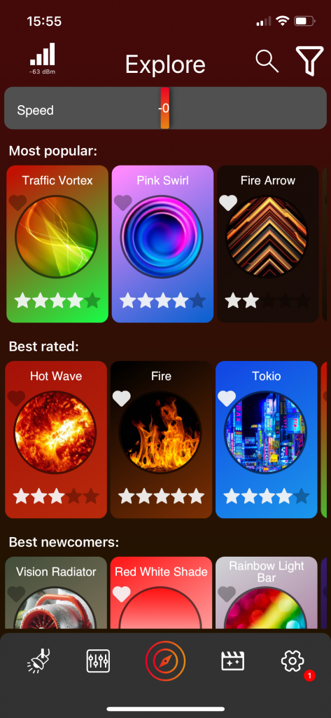
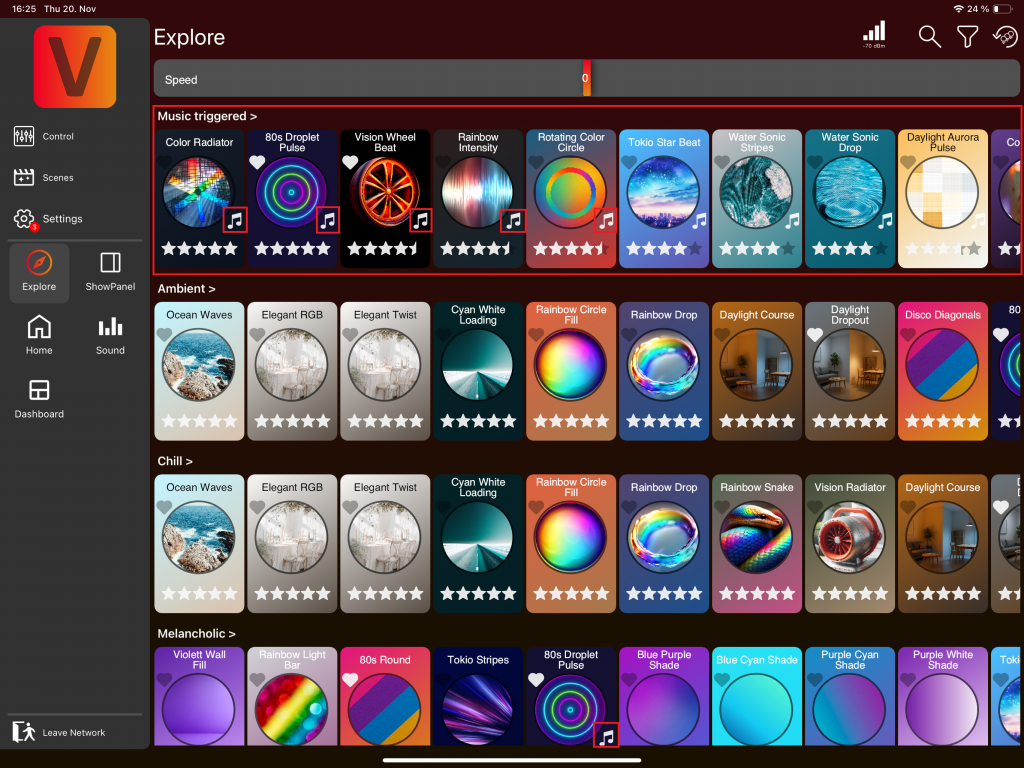
Here you can explore various templates uploaded by the community, structured into categories like Most Popular, Best Rated, Best Newcomers, etc.
Template Frame

- Template Name: Displayed at the top.
- Play Template: Click the round image in the center to play the template. It will play on the selected groups or fixtures in the lights page.
- Favorite: Click the heart icon at the top left to mark the template as a favorite.
- Rate Template: Click the stars at the bottom to rate the template.
- Detailed View: Click anywhere else on the template (except the image, stars, or heart) to open a detailed view. See section Template Detail View for more information.
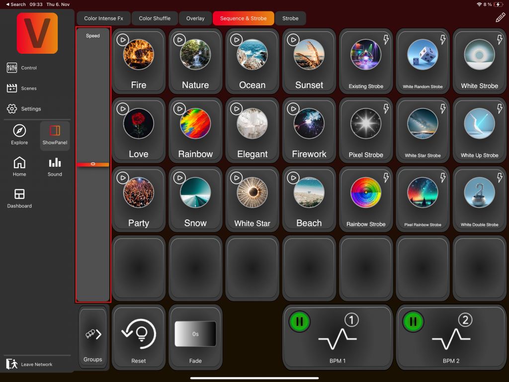
Speed Fader
At the top of the explore page, you will find a Speed Fader. This control adjusts the speed of all FX components of the selected templates. Note that if a template consists only of static components, the Speed Fader will not affect it.
Filter Icon
On the top right is a filter icon. By clicking it, the icon changes color, and a filter function opens at the top of the page. The filter function consists of several components depending on your fixtures. You can choose which components the displayed templates should include. By default, all components are selected, indicated by a colorful frame around each component. Clicking on a component toggles its selection status.
The filter function works as follows: if you have selected multiple components, at least one of them must be part of a template for it to be displayed. If only one component is selected, that component must be part of the template. This does not mean the template will consist solely of the selected component(s); it can also include additional, unselected components, though it doesn’t have to.
By clicking the filter icon again, the filter function will disappear, but the selection of filtered components is saved, and the filter icon changes its color back to the original color.
Search View
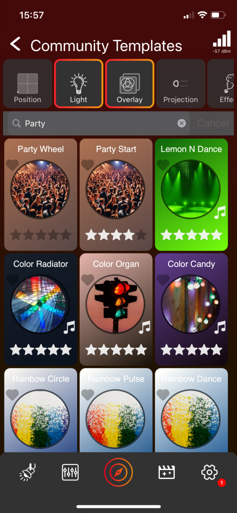
On the top right is a magnifying glass icon. By clicking it, a search view will open. This search view has a filter function on top with the same functionality as the filter function in the explore page. Below is a search bar where you can search, for example, a template name or template description. In this view, there is no separation into different categories. The template frames have the same functionality as the template frames in the explore page.
Template Detail View
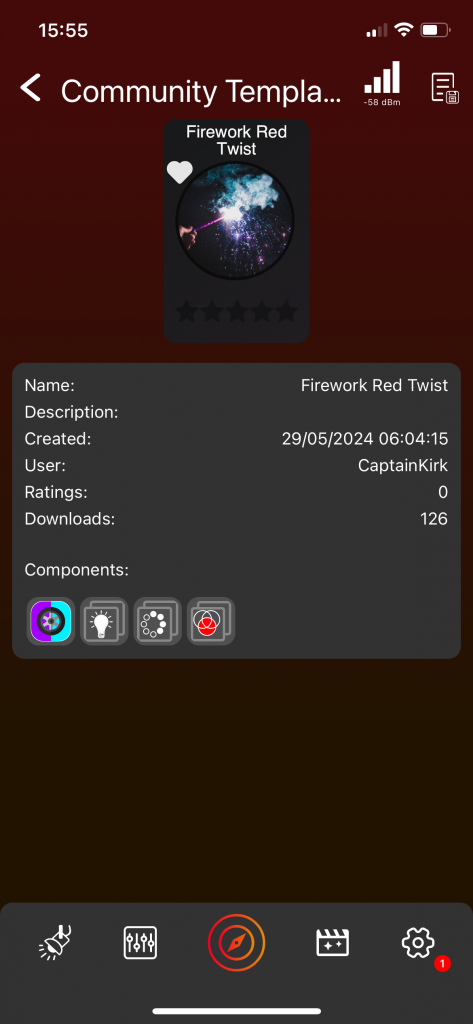
By click anywhere on the template frame (except the image, stars, or heart) the Template Detail View opens. Here you can see detailed information about the template, including description, upload date, the components of which the template is created, etc. Clicking on the Save template icon at the top, you can save this template to your local templates. Local templates can be accessed without the need for an internet connection.
Sound templates
On the Explore page, there is a dedicated section for music-triggered templates. You can recognize these templates by the music note icon displayed on the right side of the template’s preview image.
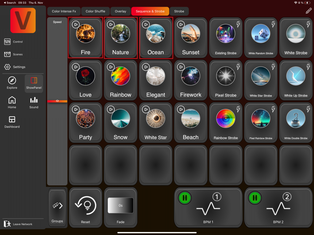
Showpanel
The first time you visit the Showpanel Page, you’ll be prompted to download recommended Showpanels if you have an internet connection. It’s highly recommended to proceed with the download.

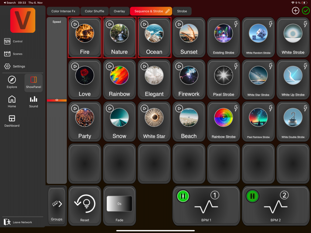
The Showpanel Page can include several Showpanels, like „Color Intense FX“, „Color Shuffle“, etc. Clicking on the corresponding tab view switches to that specific Showpanel. The current Showpanel is highlighted with a blue-green fade in the tab view, in our example this is „Sequences & Strobes“:
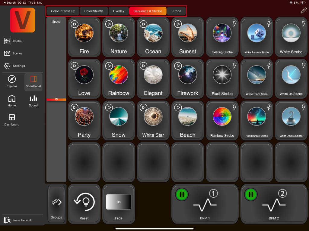
A Showpanel can consists of Template Scenes and Template Sequences. They can be activated by clicking on them:
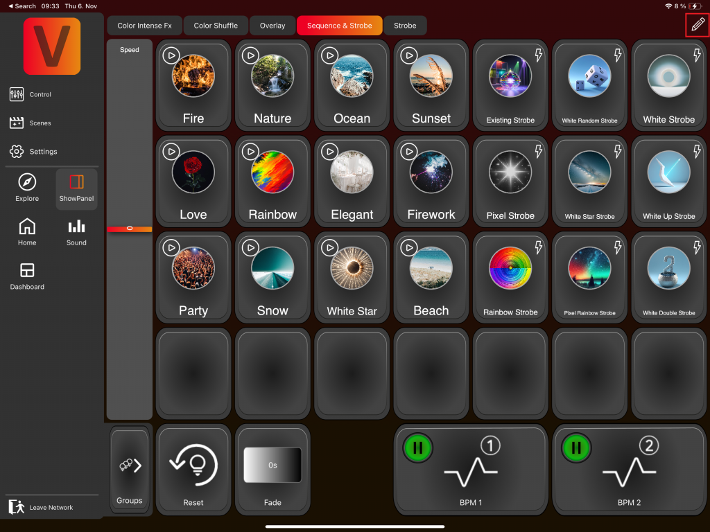
Edit Mode
The edit Mode can be activated with the edit pencil in the top right:
To deactivate the Edit Mode click on the green checkmark in the top right:
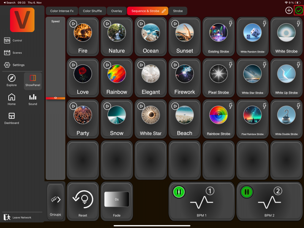
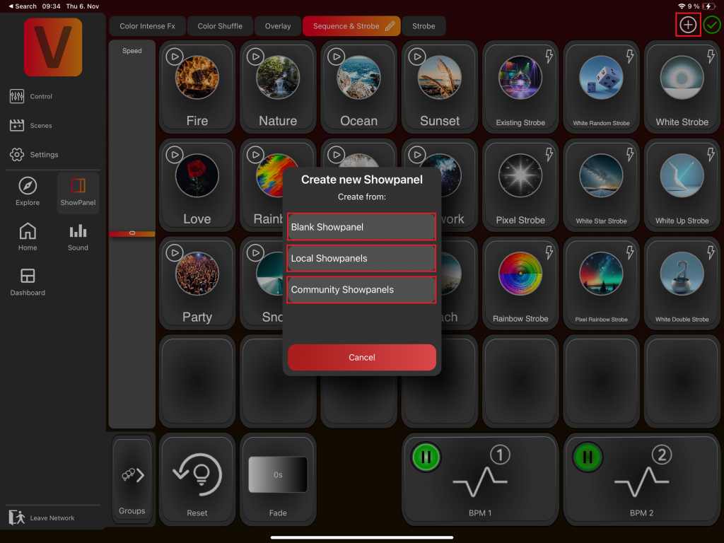
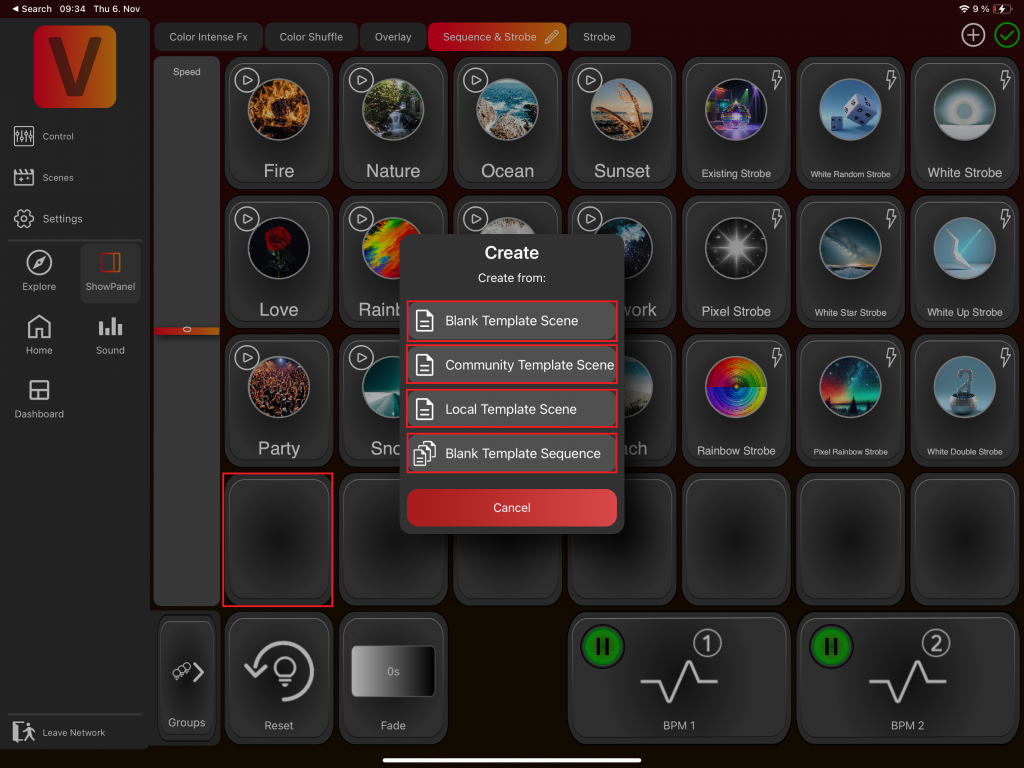
When edit mode is active, you can click the plus icon at the top to create a new Showpanel. You have the option to create a new blank Showpanel, use one of your local Showpanels, or select a Showpanel from the community:
When the edit mode is active you can click on a Template Scene or Sequence to edit it:
When the edit mode is active you can click on an empty item to create a new Template Scene or Sequence. Then you can choose between creating a Template Scene is similar to creating a Scene on the Scene Page, and creating a Template Sequence follows the same process as creating a Sequence on the Scene Page. When creating from Local or Community Template Scenes, the selected Template Scene serves as the foundation. If you choose creation from Blank , the process begins from the ground up:
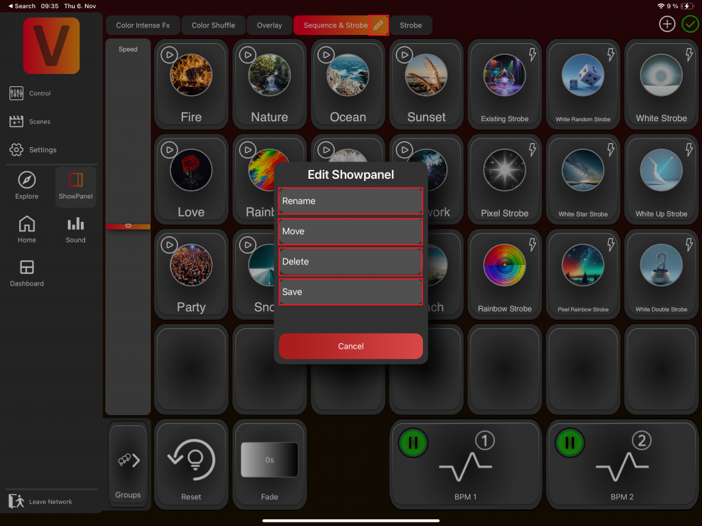
When edit mode is active, you can click the edit pencil close to the current Showpanel to rename it, move it in the tabview or delete it:
Template Scene or Sequence Item
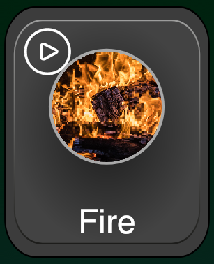
consists of:
- An image (if no image is set, a description will appear, but we recommend adding an image for clarity)
- A name
- Top-left icon: The trigger Icon (In this case the icon for a Template Sequences)
- Top-right icon: A flash icon which indicates if it is a flash Template Scene/Sequence or not (In this case it isn’t a flash Template Sequence)
Trigger
Play (Template Scene)
Trigger: Play
Description: Clicking starts the Template Scene and it plays until its end
Icon: None
Flash (Template Scene)
Trigger: Flash
Description: It plays while the Template Scene is pressed.
Icon:

Play (Template Sequence)
Trigger: Play
Description: Clicking starts the Template Sequence and it plays the first Scene. Each Scene of the Template Sequence plays a predefined time and then the next Scene of the Template Sequence will be triggered automatically.
Icon:

BPM 1 (Template Sequence)
Trigger: BPM 1
Description: Clicking starts the Template Sequence and it plays the first Scene. The next Scene will be played when a trigger signal comes from the BPM 1 Button.
Icon:

BPM 2 (Template Sequence)
Trigger: BPM 2
Description: Clicking starts the Template Sequence and it plays the first Scene. The next Scene will be played when a trigger signal comes from the BPM 2 Button.
Icon:
Tap (Template Sequence)
Trigger: Tap
Description: Clicking starts the Template Sequence and it plays the first Scene. The next Scene will be played with another click on the Template Sequence.
Icon:

Flash (Template Sequence)
Trigger: Flash
Description: It plays while the Template Sequence is pressed. Each Scene of the Template Sequence plays a predefined time and then the next Scene of the Template Sequence will be triggered automatically.
Icon:

Change Trigger
- Activate the Edit Mode and click on a Template Scene or Sequence and change the trigger there.
- Press and hold on a Template Scene or Sequence, then slightly move your finger to open the Trigger Menu. While keeping your finger pressed, drag it to the desired trigger:
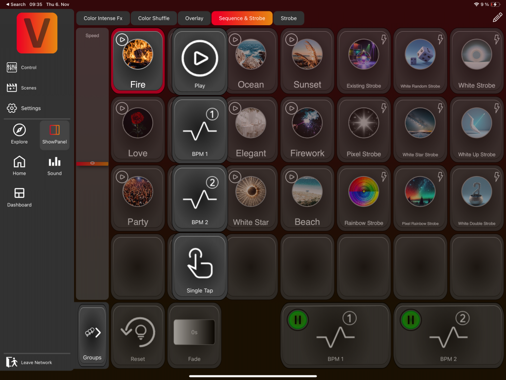
BPM Buttons
- Located in the bottom right.
- Click the red dot to activate them. Then the dot becomes green.
- The beat of the BPM Button changes the Scenes in all Template Sequences with a trigger for this BPM Button
- There are 4 methods to set the beat of a BPM Button:
Press and hold on a BPM Button, then slightly move your finger to the top of the screen to open the BPM Menu. While keeping your finger pressed, drag it to the desired method:
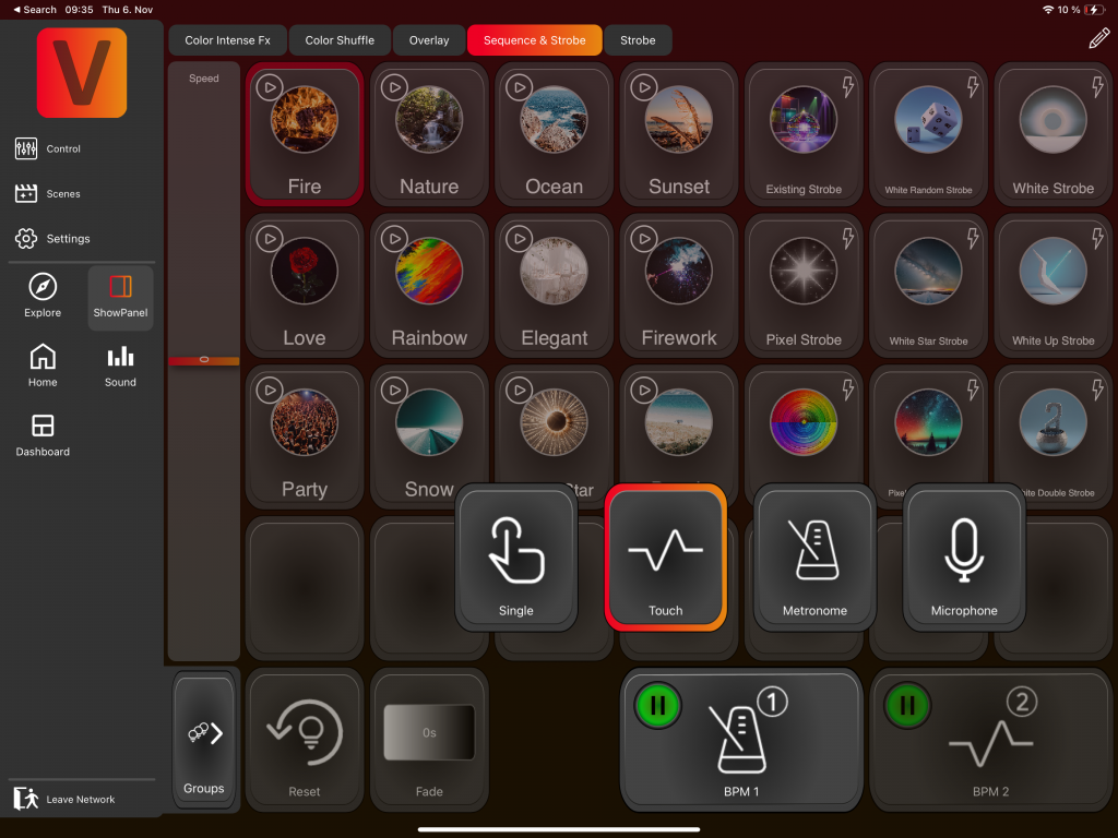
- Touch (default): Tap the BPM Button to the desired rhythm. The time between your last two taps will set the beat. A green or red dot will blink in time with the beat.
- Metronome: Click on the BPM Button and set the desired time interval in seconds.
- Microphone: The microphone will recognize the beat. This feature is in progress)
- Tap: Each tap on the BPM Button will change the Scene for the Template Sequences that have this BPM Button as there trigger.
Speed Fader
with the speed fader the speed of the FX components of a Template Scene or Sequence can be adjusted.
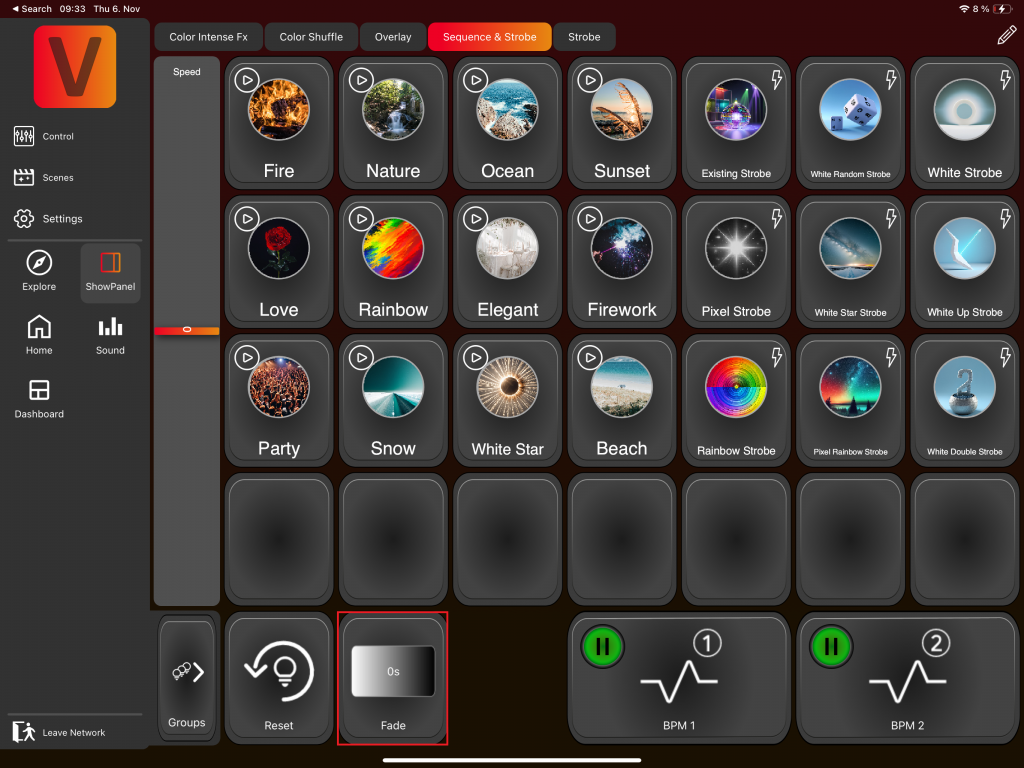
Fade
Here you can set a Fade Time.
Reset
Here you can reset all components of the selected groups.

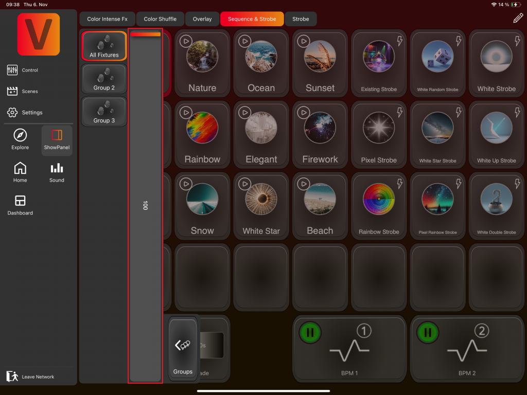
Groups & Dimmer
A new section opens on the left side:

Here you can select the desired groups. For the Showpanel this group selection is relevant and NOT the one in the Control Page. For the Showpanel it is only possibel to select groups not single fixtures are not possible (except you create a group with only one fixture inside).
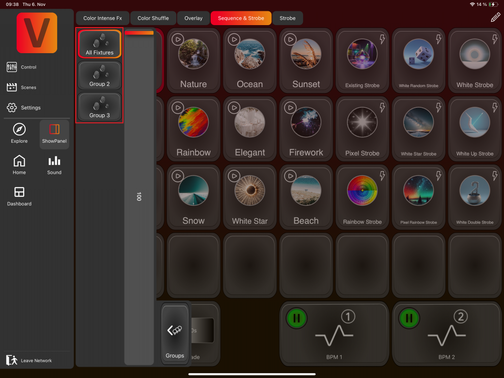
The fader is comparable with a master dimmer.
AI Sound to Light

The AI Sound to Light function automatically selects different templates, mixes them together, and switches between them in sync with the music. It’s the perfect feature if you don’t want to control anything yourself.
However, if you already know exactly which Sound-to-Light effect you want, then this is not the right place — you should create or select your effect manually instead.
When you press Play, your device (phone, tablet, or PC) listens to the music through its microphone and uses the audio signal to generate dynamic lighting effects. If you haven’t already granted microphone access, you will be prompted to allow the app to record audio for this feature.
Main Controls
Play / Pause
Start the AI Sound-to-Light function with this button:
Pause the AI Sound-to-Light function with this button:
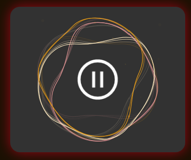
Pausing does not turn off the lights or freeze the current effect — it only stops new effects from being generated. The currently running effect continues until changed manually or by another trigger.
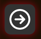
Next Effect
Pressing the arrow icon triggers the next effect manually:
Tab Views
The page contains three tabs:

Settings
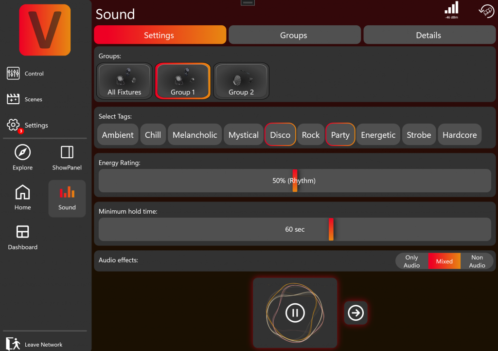
Groups
Select which groups should be controlled by the AI Sound-to-Light function.
Select Tags
Define tags that describe the atmosphere or mood you want.
The AI uses these tags to choose effects that match the desired atmosphere .
Energy Rating
This setting influences the overall mood of the effects — whether they should be calmer or more energetic, similar to the tags.
Minimum Hold Time
Define the minimum duration an effect should play before the next one will be triggered by the AI Sound-to-Light.
The change between effects is determined by the AI, but it will always respect this minimum hold time.
Audio Effects
Choose which type of effects you want the system to use:
Audio: All effects react to audio input.
Mixed: Some effects react to audio, while others are standard effects that do not react to sound.
No Audio: All effects are standard effects that do not react to sound.
In this mode, it is no longer a true Sound-to-Light feature — instead, it simply plays different templates one after another, which can still be useful for certain occasions.
Groups
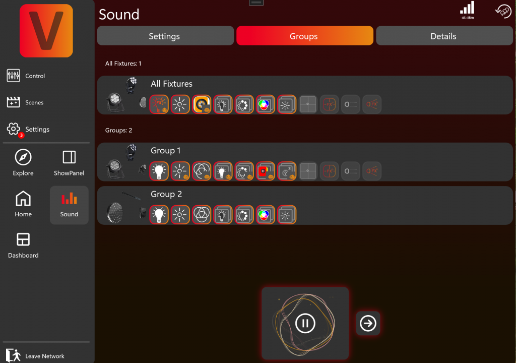
Here you can see all groups and their available components. You can see that Group 2 has fewer available components than Group 1. This is because none of the fixtures in Group 2 has components such as Zoom, Pan, or Tilt.
Click a component to select or deselect it:
Selected (red/orange border): The AI Sound-to-Light function is allowed to control this component.
Deselected: The component will not be modified by the AI.
This is especially useful for fixtures with Pan and Tilt:
For example, if you want a fixed Pan/Tilt position, set the values manually and then deselect the Pan/Tilt components. The AI will not override them.
You can configure these settings individually for every group.
Details
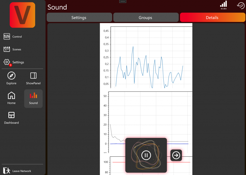
This tab displays detailed information about the audio signal received by the microphone.
Normally you don’t need this information, but if the AI Sound-to-Light function isn’t working, you can use this section to check whether the app is receiving any signal at all.
Link non Vision Fixtures via an DMX Adapter
To link a non vision fixture go to the fixture linking page and search for DMX Adapters.
Click on the DMX Adapter to link it.If the fixture is recognized via RDM and has an configuration it is automatically linked. Otherwise go with the wizard.
If the Fixture has rdm support it will be shown in the first panel.
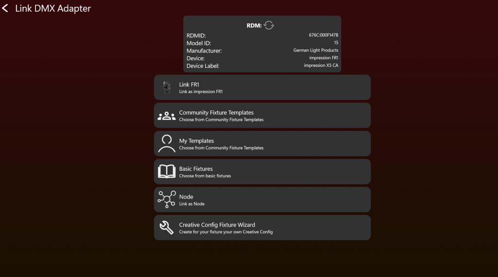
If there is an official library, you can just link it. If not you can search for community fixture templates and try them. For basic fixtures like smoke machines / or led Pars we have standard configurations. If you want to create an template yourself go with the Creative Config Fixture Wizard.
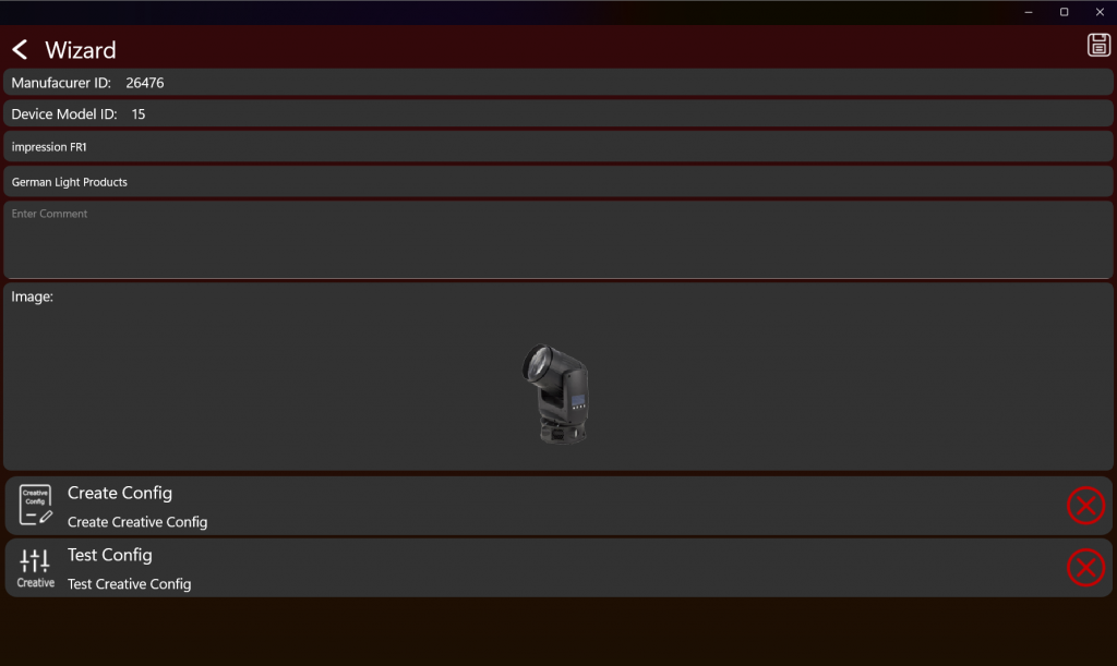
Fill in the required information and upload a suitable picture. Best is transparent with a size of 200x150px. Leave a comment with important notes or settings which must be followed so the fixture can work properly. Then you have to create an creative configuration. You can find the instructions here:
https://server.kk-t.eu/ExternalVision/TestCreative. Please note if you have an fixture with an multispectral LED Light Source. Creative Config Generation is only possible on Windows!
Impressum
Vision Control Solutions GmbH
Geschäftsnummer Handelsregister: HRB 753067
Zuständiges Amtsgericht: Mannheim
Industriestraße 4
76307 Karlsbad
Telefon: +49 1734717340
E-Mail: info@vision-cs.de
Umsatzsteuer-Identifikationsnummer gem. § 27 a Umsatzsteuergesetz: DE452700947